Cleo
Responsive Magento Theme
- created: 03/08/2015
- latest update: 07/05/2016
- by: WeltPixel Team
- email: support@weltpixel.com
Cleo Documentation
License
The use of this product must comply with its terms and conditions. The regular (standard) license allows you to create one End Product for yourself or one client.
Allowed - With regular license you can do the following:
· Install the theme on a test server for testing and development purposes
· Customize the template to fit your website's needs
Not Allowed - With the regular license you are not allowed to do the following:
· Create multiple websites. For multiple websites you will need multiple regular licenses
· Multi-store Magento installations. Each regular license entitles you to use the theme in only one store (store/domain/subdomain). For multiple stores/domains/subdomains you will need multiple regular licenses
For more information about licenses please contact us at support@weltpixel.com.
Theme Files
The theme includes the following files:
· Theme files
· Patch
· Documentation
· Licensing
· Cleo Sample data
Separate Design Package:
Cleo theme comes with its own design package for the theme as you can see in the folder structure:
app/design/frontend/cleo/default

app/design/frontend/cleo/default/layout

app/design/frontend/cleo/default/template
Design Package advantages:
· We highly recommend to use the same folder structure to implement a theme into Magento to avoid any error
· Updating your theme will not affect custom template changes
Installation
Installing Cleo on a pre-existing Magento Store:
Before installing Cleo template on a Magento Store please check the theme compatibility. Cleo is currently compatible with the following Magento versions:
Magento Community Edition:
· 1.8.0
· 1.8.1
· 1.9.0
· 1.9.1
· 1.9.2
· 1.9.2.x
Magento Enterprise Edition:
· 1.14.0
· 1.14.1
· 1.14.2
· 1.14.2.x
It is highly recommended to install the theme first on a testing server before you install it on a live (production) server.
Step 1.
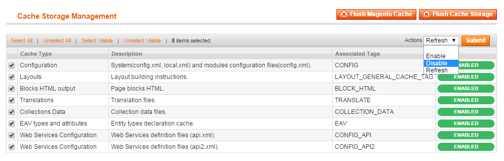
Disable Magento Cache -> System -> Cache Management -> Select all and hit disable
Step 2.
Disable compilation -> System -> Tools -> Compilation
Step 3.
Disable JavaScript and CSS file Merging -> System -> Configuration -> Developer
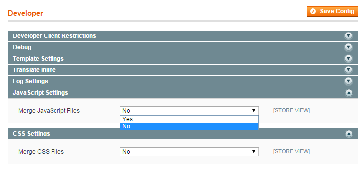
After installing the theme all the above can be re-enabled
Step 4.
If any of the base theme file was modified, please remove all changes that you made. Cleo is built as a design package that relies on the "base" Magento theme.
Magento "base" theme should never be modified! Any modification can break Cleo's functionality. All modifications should be made as a custom sub-theme.
Step 5.
Upload the content from Theme Files into the root of your Magento installation via an FTP client.
This process will not overwrite any file that you might have on your server, it will only merge them!
Step 6. Enable the Theme!!
After the steps above have been completed, enable the theme by going to:
System -> Configuration -> Design
Package -> Current Package Name -> type cleo
Themes -> Default -> type default
Step 7.
Flush any cache that you might still have enabled on your server or in Magento.
Step 8.
Check the "Patch" folder from Cleo Pack and if availlable for your magento version, apply the patch files by simply copying the patch file content on top of your Magento installation.
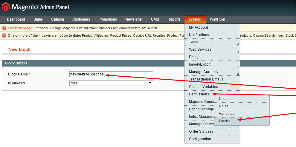
!Note: Security patch SUPEE-6788
Magento 1.9.2.2 / 1.14.2.2 or higher has this security patch included, no additional action is required.
If you install this security patch on any magento version previous than 1.9.2.2 / 1.14.2.2 you have to manually allow permision for three Weltpixel blocks in order to corectly display them.
newsletter/subscribe
weltpixel/product_list
weltpixel/product_new
You can do that from Magento Admin > System > Permisions > Block > Add New just like in the picture below.
Import Sample Content
Import theme settings
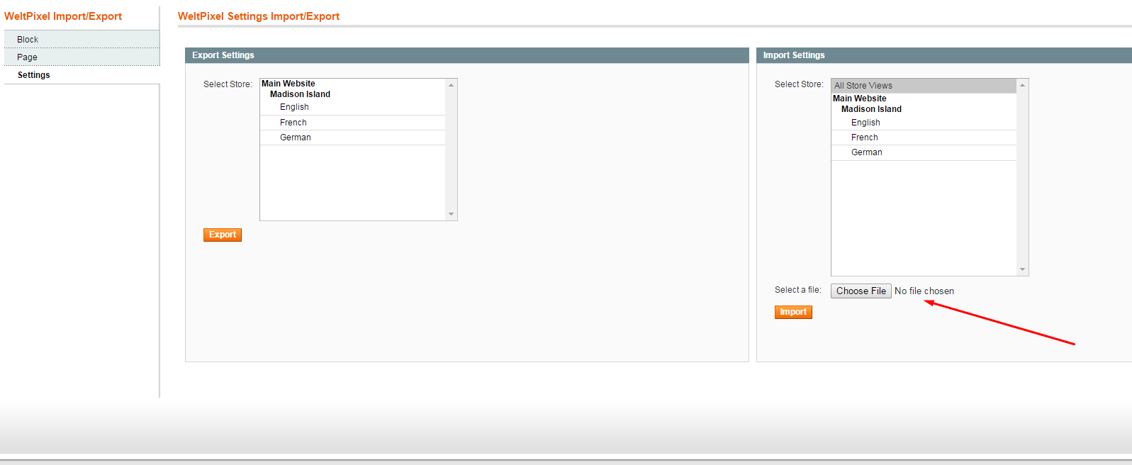
Import sample theme configuration
WeltPixel -> WeltPixel Import/Export
Choose file -> Cleo Sample Data -> sample_settings.csv
Import sample pages
WeltPixel -> WeltPixel Import/Export
Choose file -> Cleo Sample Data -> sample_pages.csv
Import Homepage Slider
To import homepage slider go to:
WeltPixel -> AM -> AM Revolution Slider -> Import
Choose file -> Cleo Sample Data -> sample_homepage_slider.zip
Logo Replacement
To replace your logo simply upload your image to this directory:
/skin/frontend/cleo/default/images/media/
Go to System -> Configuration -> Design ->Header and place the name of your image into the Logo Image Src field.
Homepage
If you want to enable the sample Cleo homepage you must select the right homepage in Magento. You can choose between 4 demo homepages we already created. Before trying to select sample homepage make sure you imported the sample content as described in the section <Import Sample Content>.
Go to System -> Configuration -> General -> Web -> Default Pages and from the dropdown menu select between
Cleo Home Page V1
Cleo Home Page V2
Cleo Home Page V3
Cleo Home Page V4
CMS page elements
Featured Products
{{block type="weltpixel/product_list" category_id="13" num_products="5" title="Featured Products" template="catalog/product/featured_products.phtml"}}
New Products
{{block type="weltpixel/product_new" num_products="5" title="New Products" template="catalog/product/new_products.phtml"}}
Recently Viewed Products
{{block type="weltpixel/product_recent" num_products="5" title="Recent Products" template="catalog/product/recent_products.phtml"}}
Category Page
We added some additional page layouts to perfectly fit your design needs:
· 1 column
· 2 columns with left bar
· 2 columns with right bar
· 3 columns
· Full Screen
· 1 column merged header
· 2 columns with left bar merged header
· 2 columns with right bar merged header
· 3 columns merged header
Merged Header
The merged header page layouts will offer a modern look to your store, it works perfectly when the header is set to transparent.

Full Width Layout
Full width page layout is especially designed to go over any boundary and take advantage of full-width design in alternative with the boxed one.
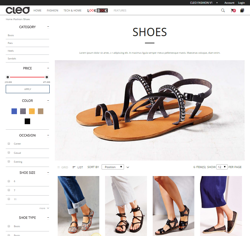
Category page extra content
Category extra content fields will offer you an additional area where you can easily plug in content.
The top section is designed to highlight beautiful category heroes and stylish category descriptions that take advantage of the full width of the page.
The bottom section is an amazing place for additional content that you might want to feature at the end of every category page such as a brand bar, recently viewed products, featured categories and extra description for SEO purposes.
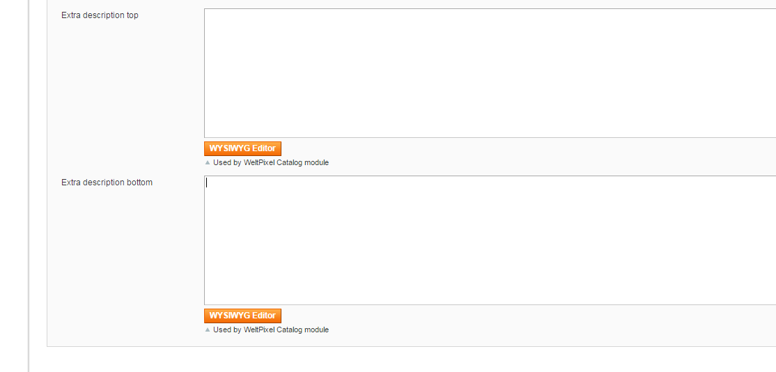
To add content to each category:
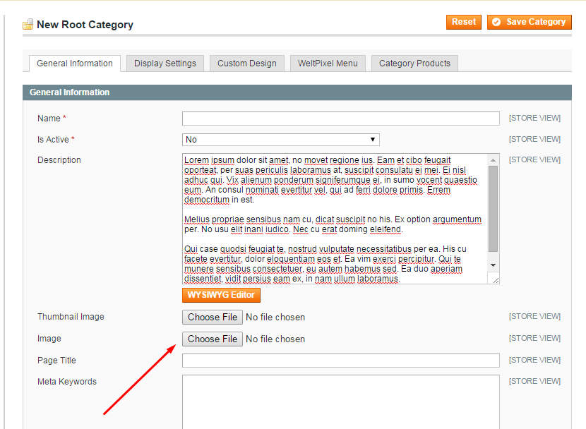
Go to Catalog -> Manage Categories -> Custom Design -> here you will find two additional text areas called Extra description top and Extra description bottom
We also considered the traditional position that works best when a left or right sidebar is used. In this scenario the category description goes under General Information -> Description and the image in the image upload section.
All content areas can be used either separate or combined.
Look and feel of the category page
Additional customization options can be found under:
WeltPixel -> Cleo Theme -> Theme Settings -> Category page options
· Quick view design - Cleo offers 2 quickview styles
o Inline
o Lightbox
· Any product information setting can be enabled or disabled , the list of options include:
o Show Price [ Yes / No ] *Choose the quick view design
o Show Ratings [ Yes / No ] *The element will be displayed on product hover
o New and Sale tag [ Yes / No ] *The element will be displayed on product hover
o Product name [ Yes / No ] *The element will be displayed on product hover
o Add to cart button [ Yes / No ] *The element will be displayed on product hover
o Add to wishlist button [ Yes / No ] *The element will be displayed on product hover
o Add to compare [ Yes / No ] *The element will be displayed on product hover
o Quickview [ Yes / No ] *The element will be displayed on product hover
o Add to cart button behavior [ Open lightbox / open product page ]
o One line title [ Yes / No ] *Limit the product title to one line
o Equal height of product grid images [ Yes / No ]
o Image size [ Value, without px]
o Activate Magento swatches on product listing pages [ Yes / No ] *Default swatches only in magento 1.9.1 and over. Make sure they are enabled in Cofigurale Swatches Menu
o Hide title [ Yes / No ]
o Default category page layout [ 1,2,3 columns with left or right bar / Full screen / 1,2,3 columns with merged header and left or right bar ]
· Sidebar options
o Recently compared products enable [ Yes / No ]
o Pool enable [ Yes / No ]
o Compare products enable [ Yes / No ]
o Newsletter signup enable [ Yes / No ]
o Tags enable [ Yes / No ]
o Recently viewed enable [ Yes / No ]
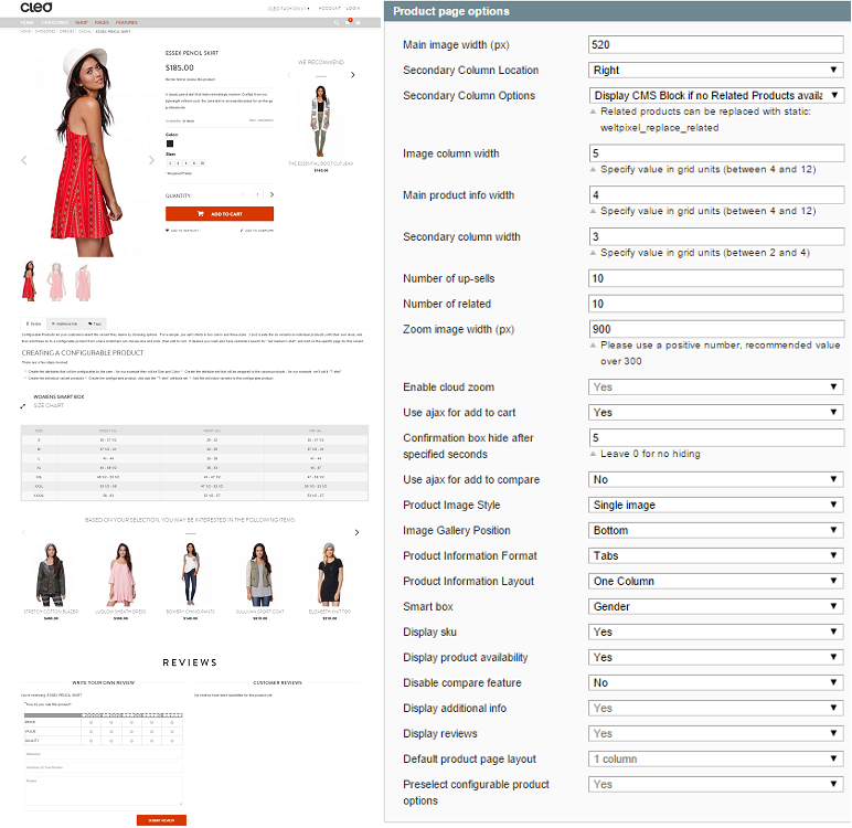
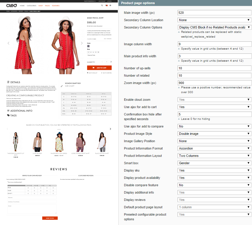
Product Page
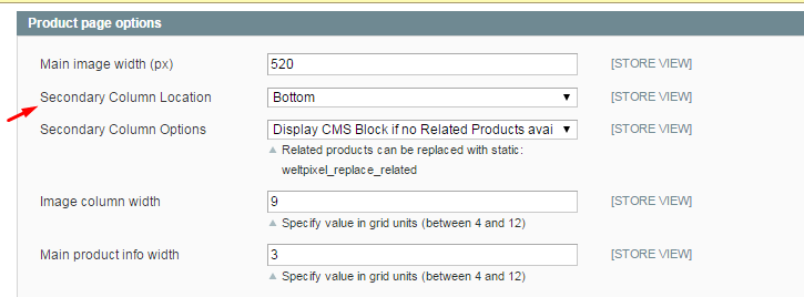
WeltPixel -> Cleo Theme -> Theme Settings -> Product page options
The product pages in Cleo are extremely customizable; we even included a Smart box!
Right from the beginning you can select the layout that you want and from here you will have to define the ratio of each block. You can even define if you wish your secondary column to be displayed on the right hand side or below the main product info section. This option is available below
Here is an example of right secondary column location:
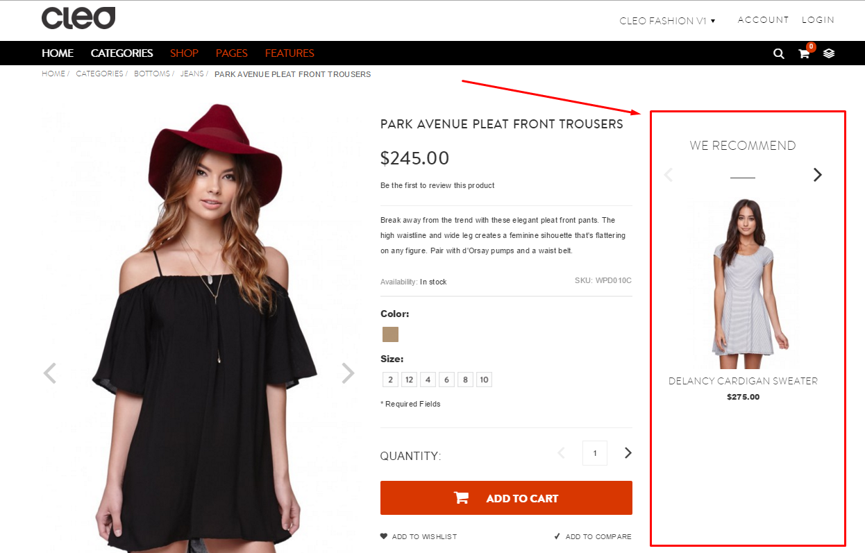
After you have decided on the final position of the secondary column, you can choose between displaying the related product or some custom CMS block when there are no related products.
The next step would be to define the width of each section. If you choose to have the secondary column on the right hand side you will have the following options:
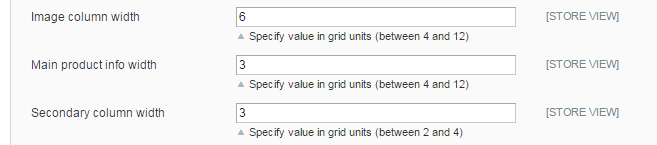
!Note: Make sure that the sum of the columns is not more than 12.
The above example will set:
· Image section to be 50% of the width of the website
· Product info section 25% of the width
· Secondary column 25% of the width
This will only look like this on desktop, on mobile devices the columns will automatically take advantage of the responsive design.
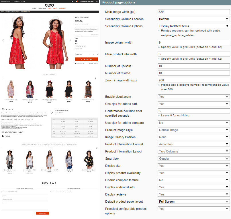
Product Image Style
WeltPixel -> Cleo Theme -> Theme Settings -> Product page options -> Product Image Style [ Single or Double image] (double image example below)
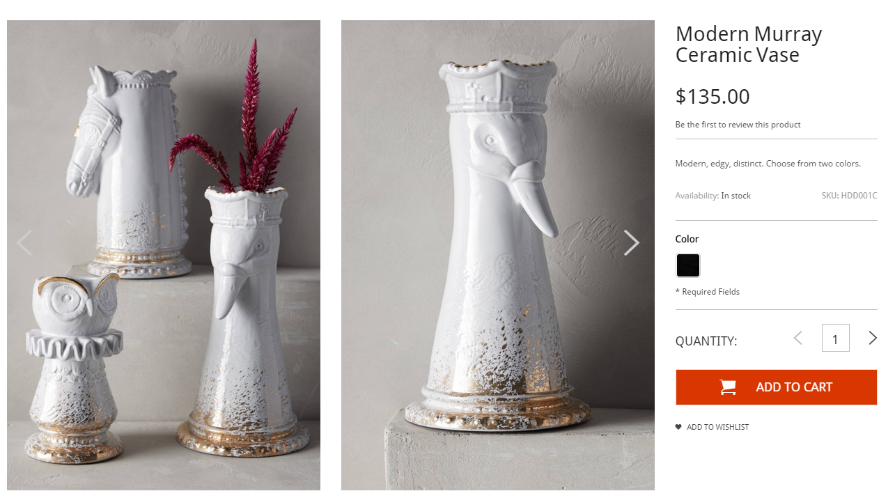
Image gallery position
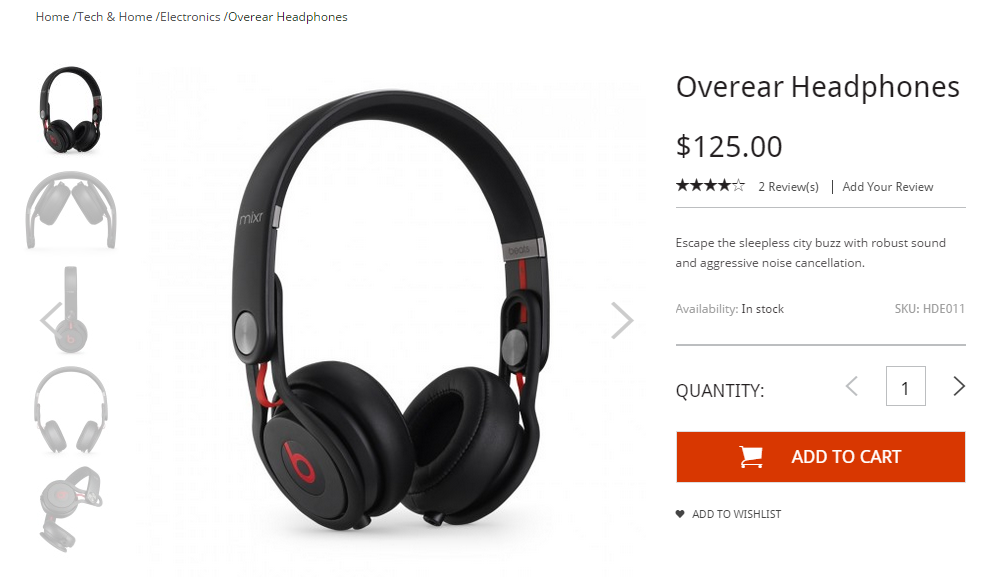
WeltPixel -> Cleo Theme -> Theme Settings -> Product page options ->Image gallery position [ Left / Bottom or None] (left gallery example below)
Product Information Layout
WeltPixel -> Cleo Theme -> Theme Settings -> Product page options ->Product Information Layout [Single or Double column] (double column example below)
Product information Format
WeltPixel -> Cleo Theme -> Theme Settings -> Product page options ->Product Information Format [ Accordion / List / Tabs ] (accordion example below)

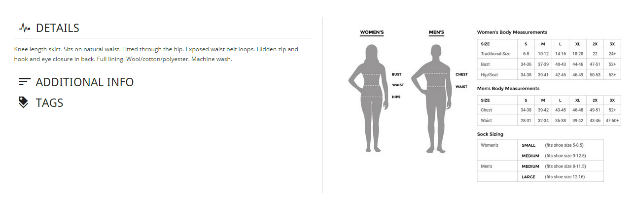
The left hand side is the long description, additional info and tags section. This section can be styled to be either Accordion, List or Tabs.
On the right hand side comes what we call "Smart Box".
Smart Box
The smart box is designed for attribute specific product information. You can easily select an attribute such as Brand or Apparel type and based on the attribute value you can display for example size charts or shipping info.
How to setup a smart box in 2 steps:
WeltPixel -> Cleo Theme -> Theme Settings -> Product page options -> Smart Box
1. Select the attribute based on which you want to setup the attribute specific content
2. Go to CMS -> Static Blocks and create a block that follows this syntax:
[attribute value]_smart_box
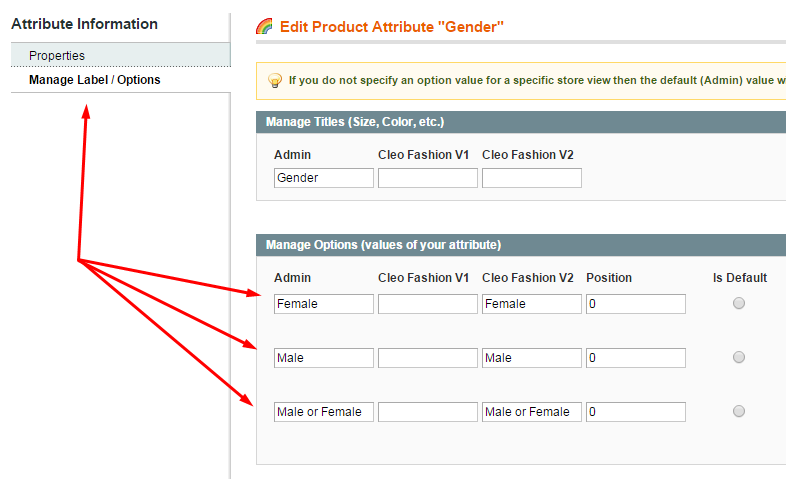
Example: female_smart_box
The attribute value can be found under Catalog -> Attributes -> Manage Attributes
Select the attribute, (gender) -> Managed Label / Options
Carousels on product page
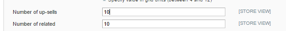
Limit the number of upsell or related products that you want to show on product page. It may be possible you have a lot of related and upsell products, with this options you can limit the number showed in the carousels on the product page.
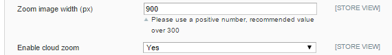
Cloud zoom
With this intuitive option users ca zoom into your product by simply mousing over them, and can be enabled in 2 easy steps:
WeltPixel -> Cleo Theme -> Theme Settings -> Product page options -> Enable cloud zoom -> Yes
WeltPixel -> Cleo Theme -> Theme Settings -> Product page options -> Zoom image width (px) -> [value]
Ajax for add to cart and add to compare
You can disable ajax for add to cart or for add to compare with a single click.
WeltPixel -> Cleo Theme -> Theme Settings -> Product page options -> Use ajax for add to cart -> [ Yes / No ]
WeltPixel -> Cleo Theme -> Theme Settings -> Product page options -> Use ajax for add to compare -> [ Yes / No ]
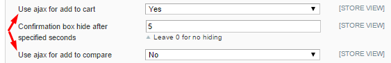
Add to cart confirmation box
You can set the add to cart confirmation box to hide after a specified number of seconds, if you don't want autohide, set the value to 0.
WeltPixel -> Cleo Theme -> Theme Settings -> Product page options -> Confirmation box hide after specified seconds [value in seconds]
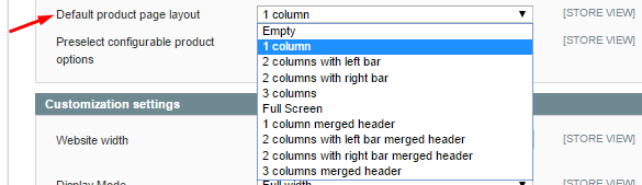
Product page layout
Select the layout you want for the product page.
WeltPixel -> Cleo Theme -> Theme Settings -> Product page options -> Default product page layout
Preselect configurable product options
This option is available ONLY with WeltPixel Swatches but not with magento default swatches. See the chapter "Layered navigation and color swatch" for activating WeltPixel swatches.
If is set to [Yes] the first option for each swatch is pre-selected and the client can just hit "Add to cart" without having to select the <default> options.

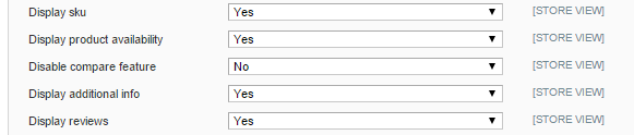
Sku, Availability, Compare feature, Additional info and Reviews
You can enable or disable these page elements by selecting [ Yes / No ] for each of them.
Example 1 of product page with settings and frontend view
Example 2 of product page with settings and frontend view
Example 3 of product page with settings and frontend view
Header Options
WeltPixel -> Cleo Theme -> Theme Settings -> Header options
Header Style 1
Header Style 2

Header Style 3
Other Header options:
· Sticky Header [ Yes / No ]
· Sticky Header on mobile [ Yes / No ]
· Search design [ Version1 / Version 2 ]
· Disable compare features [ Yes / No ]
Mega Menu
Weltpixel -> MegaMenu -> General Settings
· Enable MegaMenu – [Yes / No ] , if you do not have other extension of MegaMenu this option should be yes.
· Display home link - [ Yes / No ], choose to display or not the Home link in the MegaMenu.
· Always display category blocks - [ Yes / No ], if set to "Yes", custom Category Blocks will be displayed in the drop-down box even if the category doesn't have any subcategories.
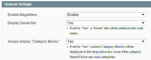
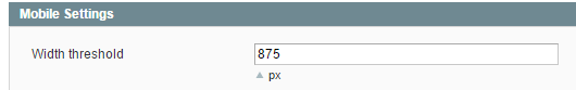
Weltpixel -> MegaMenu -> Mobile Settings
· Width threshold - [ value] px, threshold on mobile devices when MegaMenu changes from desktop view to off canvas MegaMenu.
Catalog -> Manage Categories -> WeltPixel Menu
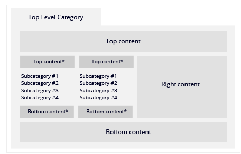
Content Areas
The Mega Menu was built to hold additional content in 3 main areas
· Top Block – category block displayed above the subcategories.
· Right Block – category block displayed at the right side of the subcategories.
· Bottom Block – category block displayed below the subcategories.
Number of columns in dropdown menu
Define the number of subcategory columns that you wish to have, for example if you have 4 main subcategories and you choose 2 columns, it will render 2x2.
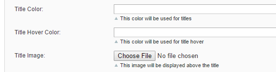
Title appearance customization
You can customize the appearance of the title of every category with the help of these 3 options:
· Title color - input the code of the title color or just use the color picker
· Title hover color – input the code of the title color when mousing over it or just use the color picker
· Title image - you can even use an image for the title of category, just choose the file and upload it
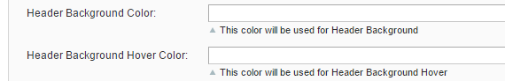
Header appearance customization
You can customize the appearace of the header with the help of these 3 options:
· Header color - input the code of the header color or just use the color picker
· Header hover color – input the code of the header color when mousing over it or just use the color picker
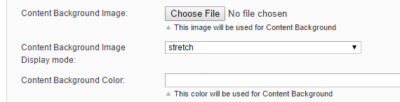
Content appearance customization
You can customize the appearance of the mega menu content box with the help of these 3 options:
· Content background image - select an image for the background of the content box
· Display mode – [ Stretch or Repeat ]
· Content background color - input the code of the content background color or just use the color picker
Custom Link option
If you would like to have a custom link in the main navigation just scroll to the URL section and in the custom link field type any of the following solutions:
· Use http:// to create an external link
· Use "/" to create a link to the homepage
· Use "#" to disable the link
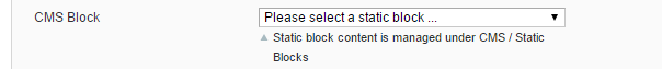
CMS block in mega menu
You can insert a static block in MegaMenu, just select the block from this dropdown list.
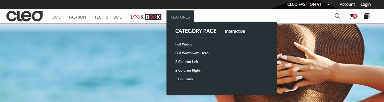
Below, in <full width> display mode, you can see an example of CMS block inserted in the mega menu just by selecting it with this mega menu option.
Display Mode
· Full width - Width of the menu dropdown is full width, side to side. This option is the best if you want to feature a lot of content in your MegaMenu
· Sectioned - It's very similar to full width, you can take advantage of all the MegaMenu blocks and options. However this selection will be aligned perfectly with the position of the tab you are hovering over
· Dropdown - Standard dropdown menu
Website customization settings
WeltPixel -> Cleo Theme -> Theme Settings -> Customization Settings
· Website width - [value]px , input website width in pixels, ex: 960px

· Display mode - [ Full width or Boxed ]
· Enable ionicons - enable ionicons as well in the theme.
· Load custom CSS - Enable this option to load "wp_custom.css" file in which you can override the default styling of the theme. File is located in /skin/frontend/cleo-v1/default/css/ directory.
· Enable retina images- [ Yes / No ]
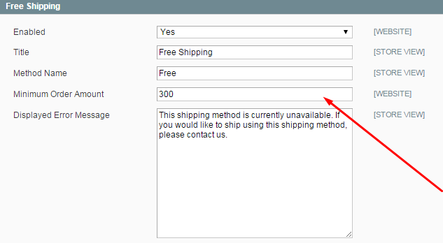
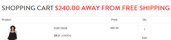
· Enable free shipping message - [ Yes / No ] , if [ yes] it will always show in the shopping cart that you offer free shipping over an treshold ammount that you set and calculates how much the client has to spend in order to get free shipping. If set to [no], if will show in your shopping cart ONLY after you reach the treshold ammount for free shipping.
To enable free shipping message calculator got to WeltPixel -> Theme Settings -> Customization settings -> Enable free shipping calculator message -> Yes
To configure the value for free shipping, go to System -> Configuration -> Shipping Methods -> Free Shipping
· Remove shipping estimator - [ Yes / No ]
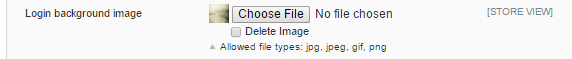
· Login background image - customize the login page by uploading a picture in the following formats: jpg, jpeg, gif or png.
· Login page layout - select the layout of the login page.
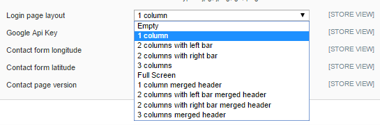
· Google API key - fill in the Google API key for your contact page.
· Contact page longitude and latitude - insert the latitude and longitude in order to locate the pin on the contact page. The longitude and latitude of your address can be easily obtained from services such as http://www.gps-coordinates.net/
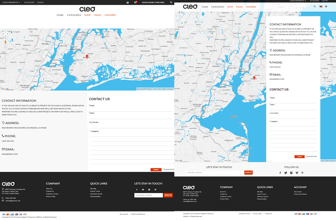
· Contact page - [ Version 1 or Version 2 ] , select between 2 versions of contact page.
AjaxSearch and Autocomplete
WeltPixel -> Ajax Search and Autocomplete
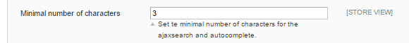
Minimal number of characters
Define here after how many characters you want to start searching and displaying results in the preview section.
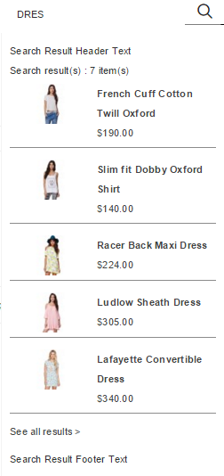
More items message in footer of results.
Use the following line of code if you want to change the message for more results:
<p class="more_result">For more results click: <a href="javascript:void(0)" id="advanced_search">here</a></p>
Additional options:
· Thumbnail width/height, px - defines the size of the product thumbnail
· Maximum no. of items displayed - set the max no. of items that can be displayed
· Show short description - [ Yes / No ]
· Show Price - [ Yes No ]
· Text for no search result - define the text in case the search returns no results
· Search results header - text displayed in the dropdown above the search results
· Search results footer - text displayed in the dropdown under the search results
· Width of results container - defines the size of the container in which the search result previews are located, please specify the width of the container without px.
Newsletter Popup
WeltPixel -> Newsletter
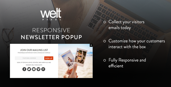
Display Mode
· Just homepage - It will display the newsletter pop-up box only on the homepage
· All pages - It will display the newsletter on all the pages except checkout and cart page (we considered that there, the most important is to let the customer concentrate on the checkout process instead of disturbing them from the main reason they are on your website)
· Display after visited pages - In this section you can define after how many visited pages you want to display the newsletter popup box. (We recommend to initiate the newsletter popup box after at least 2-3 visited pages, this way they get familiar with your website and they do not automatically close the box)
· Display on mobile - [ Yes / No ]
· Wait this seconds to display - Define here how many seconds after the webpage loads you want to display the Newsletter popup
· Display static block - by default the content of your newsletter box lives in the static block weltpixel_newsletter however you are not limited to use this block, here you have the option to switch between any static block.
· Popup Lifetime - this option defines the lifetime of the newsletter cookie (This option is great if you decide to feature a promotional message that requires the customer to sign-up for a newsletter)
· Disable newsletter pop-up:
o Close button is clicked - it will disable completely the newsletter box from appearing after the close button is clicked
o From Close button or clicked outside of the box - it will disable the new newsletter box in any of the mentioned situations, beneficial if you experience a high bounce rate after enabling the newsletter pop-up box
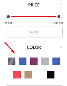
Layered Navigation and Color Swatch
Layered Navigation simplifies the product search filtering items based on their attributes. For example, handbags can be filtered by color, size, material, price, etc. Since your visitors know what interests them the extension allows finding the desired product faster.
The look and feel of the Layered Navigation can be easily customized by going under:
WeltPixel --> Layered Navigation
Here you will find self explanatory descriptions for each look and feel option.
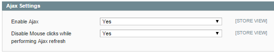
Enable Ajax - [Yes / No ], enable or disable ajax in layered navigation.
Disable Mouse clicks while performing Ajax refresh - [Yes / No ], enable or disable users mouse click while performing ajax.
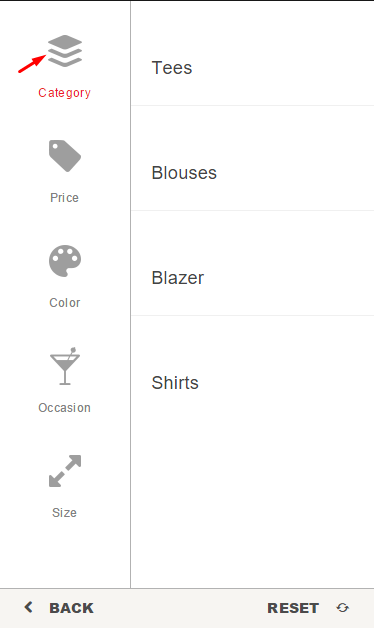
Filter Positioning - [ Left column / Top / Right Column], select where you want the filters to be displayed.
Show currently shopping by - [ Yes / No ], show the already selected filters or not.
Show Categories as - [ Default or Dropdown ], on default view only one category ca be selected at a time
Show product count for categories - [ Yes / No ], you can choose to show the no. of products available in categories.
Show product count for attributes - [ Yes / No ], you can choose to show the no. of products for each attribute
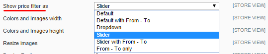
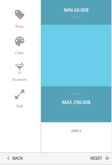
Show price filter as - [ Default / Default From-To/ Dropdown / Slider / Slider From-To / From-To only ]
Show All other filters as - [ Default / Checkbox or Dropdown ]
Sort Items by - [ Position / Name or Count ]
Order Items by - [ Ascendent or Descendent ]
Display all items as - [ Show more and less / Default ], if selected [show more and less], also configure the Show item limit below. !Note: On mobile devices only default display will be available, we have plenty of space on mobile layered navigation to show all options without the need of <show more>.
Show item limit - [ value ], limit the nr of items to display, you can see the rest of the items that is over this limit with <show more/less> option.
Show "Clear All" - [ Yes / No ], with clear all you can clear all selected filters with one click
Category Image On Mobile Devices - [upload file], on mobile devices you have the mobile version of filters, and each attribute and the category tab have a suggestive image displayed. Here you can upload the image for category tab. The rest of the images for attributes are uploaded in the attribute settings, as you can see at the end of this chapter.
Individual Attribute Filter Customization
Any attribute that you have can be customized by style:
· Default
· Checkbox
· Dropdown
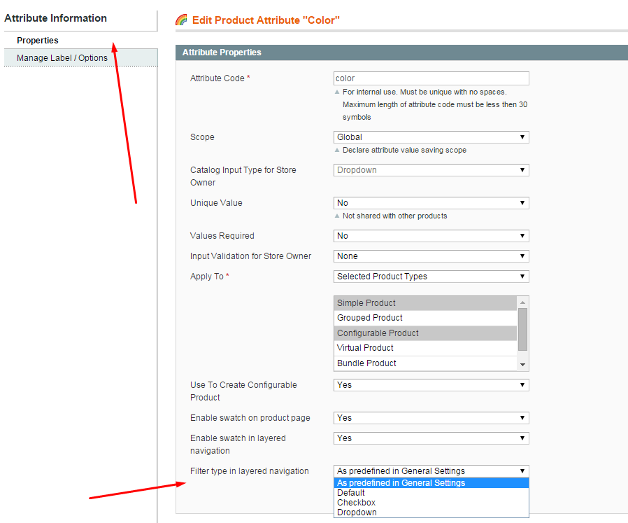
Just go to Catalog -> Attributes -> Manage Attributes
Here you will find the full list of attributes that your Magento Store is using, select the attribute that you wish to change the style.
Under the proprieties tab you will find Filter type in layered navigation. This option will allow you to select the design that will work the best with your attribute.
Color Swatch Customization
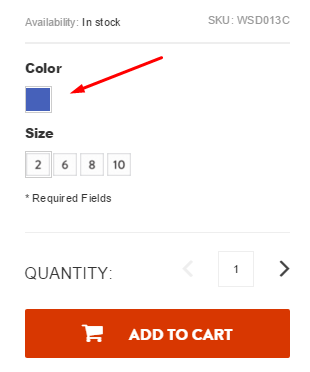
Using the color swatches is an amazing option for any attribute (color, material, manufacturer etc).
***Product page swatch configuration:
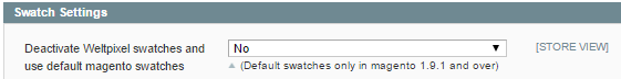
You can choose to use our weltpixel swatches or the Default Magento Swatches (available only in magento 1.9.1 and over) by enable or disable this option: WeltPixel -> Product Page Swatches -> Deactivate Weltpixel swatches and use default magento swatches - [Yes / No ].
!! If you choose [ No ] than you will use our own swatches and all the options below will be activated.
!! If you choose [Yes] than default mageno swatches it will be automatically activated and you can set the swatches using magento documentation; none of the options below will be active.
Here you can easily define the product page swatch size, resize as well as you can define the border radius with the options below:
Colors and Images width - [ value ] in px, do not specify px in the box.
Colors and Images height - [ value ] in px, do not specify px in the box.
Resize images - [ Yes / No ]
Border Radius - [ value ] in px, do not specify px in the box.
***Category page swatch configuration:
WeltPixel ->Cleo Theme -> Theme settings -> Category page options -> Activate Magento swatches on product listing pages - [ Yes / No] .
!! Choose [ No ] and you will use our own weltpixel swatches and all the options below will be activated.
!! Choose [Yes] and default magento swatches it will be automatically activated and you can set the swatches using magento documentation; none of the options below will be active.
!Note: Make sure the configurable swatches are also activated in System ->Configuration -> Catalog -> Configurable Swatches
After you activated the swatches you can find additional swatch options below:
WeltPixel -> Layered Navigation ->
Here you can easily define the category page (layered navigation) swatch size, resize option (if the image uploaded by you is bigger than the size defined by you as well as you can define the border radius.
Colors and Images width - [ value] in pixels but without px.
Colors and Images height - [ value] in pixels but without px.
Resize images - [ Yes / No ], if [yes] images that you upload are resized at the sizes specified in above settings.
Border Radius - [value] - [ value] in pixels but without px.
Assign images to your attributes and setup color swatch
The proper way to setup Color Swatch and Layered Navigation is the following:
1) Enable color swatch to any of your attributes:
Catalog -> Attributes -> Manage Attributes select the attribute that you wish to assign images and select Yes for the following two options:
· Enable swatch on product page [ Yes / No ]
· Enable swatch in layered navigation [ Yes / No ]
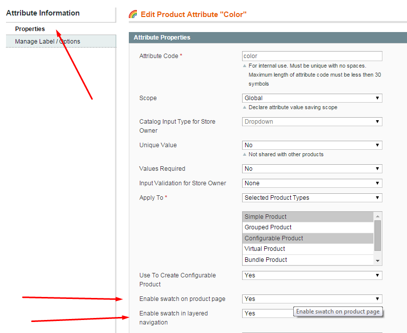
Here you can define if you would like to enable swatches in layered navigation (category pages) and product page (option when adding the product to your cart)
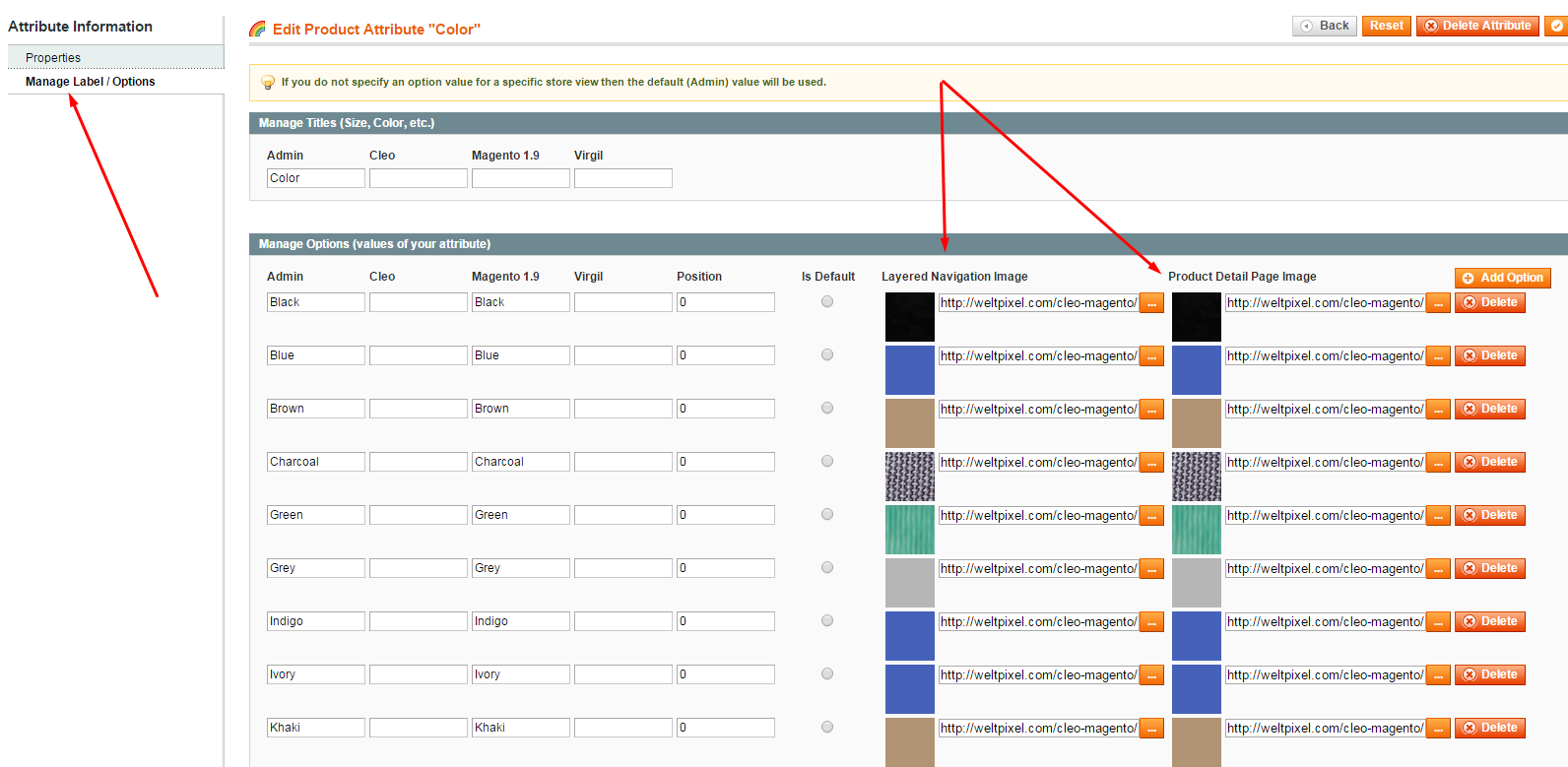
2) To assign an image to any attribute click on the Manage Label Options.
Here you will find the option to assign images to any of your attribute values.
Tip: you can assign the exact same image to both pages, however we offer you the option to have different images for each page (product page/category page)
Mobile design attribute images
|
For mobile devices we found that it is very complicated to use the layered navigation on most websites. So we managed to optimize our design for the best UX. Each attribute image can be easily assigned to any attribute that you are using: WeltPixel -> Attribute Images Select the attribute that you want to assign an image for mobile design Note: The image for category can be uploaded from Weltpixel -> Layered Navigation -> Category Image On Mobile Devices
|
|
Page elements
Page Titles
| Class | Description | Example |
|---|---|---|
Default |
Default Page Title style with Text aligned Left & Breadcrumbs Right. |
<section id="page-title"> <div class="container clearfix"> <h1>Page Title</h1> <span>A Short Page Title Tagline</span> <ol class="breadcrumb"> <li><a href="#">Home</a></li> <li><a href="#">Shortcodes</a></li> <li class="active">Page Titles</li> </ol> </div> </section> |
.page-title-right |
Page Title style with Text aligned Right & Breadcrumbs Left. |
<section id="page-title" class="page-title-right"> <div class="container clearfix"> <h1>Page Title Right</h1> <span>A Short Page Title Tagline</span> <ol class="breadcrumb"> <li><a href="#">Home</a></li> <li><a href="#">Shortcodes</a></li> <li class="active">Page Titles</li> </ol> </div> </section> |
.page-title-center |
Page Title style with Text & Breadcrumbs aligned Center. |
<section id="page-title" class="page-title-center"> <div class="container clearfix"> <h1>Page Title Center</h1> <span>A Short Page Title Tagline</span> <ol class="breadcrumb"> <li><a href="#">Home</a></li> <li><a href="#">Shortcodes</a></li> <li class="active">Page Titles</li> </ol> </div> </section> |
.page-title-mini |
Page Title style with Mini Title. |
<section id="page-title" class="page-title-mini"> <div class="container clearfix"> <h1>Page Title Mini</h1> <span>A Short Page Title Tagline</span> <ol class="breadcrumb"> <li><a href="#">Home</a></li> <li><a href="#">Shortcodes</a></li> <li class="active">Page Titles</li> </ol> </div> </section> |
.page-title-dark |
Page Title style with Background Color Dark. |
<section id="page-title" class="page-title-dark"> <div class="container clearfix"> <h1>Page Title Dark</h1> <span>A Short Page Title Tagline</span> <ol class="breadcrumb"> <li><a href="#">Home</a></li> <li><a href="#">Shortcodes</a></li> <li class="active">Page Titles</li> </ol> </div> </section> |
.page-title-nobg |
Page Title style with Background Color Transparent. |
<section id="page-title" class="page-title-nobg"> <div class="container clearfix"> <h1>Page Title No BG</h1> <span>A Short Page Title Tagline</span> <ol class="breadcrumb"> <li><a href="#">Home</a></li> <li><a href="#">Shortcodes</a></li> <li class="active">Page Titles</li> </ol> </div> </section> |
.page-title-pattern |
Page Title style with a Background Pattern. |
<section id="page-title" class="page-title-pattern"> <div class="container clearfix"> <h1>Page Title with Pattern</h1> <span>A Short Page Title Tagline</span> <ol class="breadcrumb"> <li><a href="#">Home</a></li> <li><a href="#">Shortcodes</a></li> <li class="active">Page Titles</li> </ol> </div> </section> |
.page-title-parallax |
Page Title style with a Parallax Image. |
<section id="page-title" class="page-title-parallax page-title-dark" style="background-image: url('');"
data-stellar-background-ratio="0.3">

	<div class="container clearfix">
		<h1>Page Title Parallax</h1>
		<span>A Short Page Title Tagline</span>
		<ol class="breadcrumb">
			<li><a href="#">Home</a></li>
			<li><a href="#">Shortcodes</a></li>
			<li class="active">Page Titles</li>
		</ol>
	</div>

</section>
|
.page-title-video |
Page Title style with a HTML5 Video. |
<section id="page-title" class="page-title-parallax page-title-dark page-title-video"> <div class="video-wrap"> <video width="100%" src="images/videos/deskwork.mp4" preload="auto" loop autoplay muted></video> <div class="video-overlay"></div> </div> <div class="container clearfix"> <h1>Page Title Video</h1> <span>A Short Page Title Tagline</span> <ol class="breadcrumb"> <li><a href="#">Home</a></li> <li><a href="#">Shortcodes</a></li> <li class="active">Page Titles</li> </ol> </div> </section> |
Columns & Grid
Cleo Grid
Bootstrap Grid
Helper Classes
We have created some really useful helper classes for you. Here are a few of them:
-
.allmargin- Margin of 50px on all sides. -
.topmargin- Margin of 50px on the top side. -
.bottommargin- Margin of 50px on the bottom side. -
.leftmargin- Margin of 50px on the left side. -
.rightmargin- Margin of 50px on the right side. -
.allmargin-sm- Margin of 30px on all sides. -
.topmargin-sm- Margin of 30px on the top side. -
.bottommargin-sm- Margin of 30px on the bottom side. -
.leftmargin-sm- Margin of 30px on the left side. -
.rightmargin-sm- Margin of 30px on the right side. -
.allmargin-lg- Margin of 80px on all sides. -
.topmargin-lg- Margin of 80px on the top side. -
.bottommargin-lg- Margin of 80px on the bottom side. -
.leftmargin-lg- Margin of 80px on the left side. -
.rightmargin-lg- Margin of 80px on the right side. -
.nomargin- No Margin on all sides. -
.notopmargin- No Margin on the top side. -
.nobottommargin- No Margin on the bottom side. -
.noleftmargin- No Margin on the left side. -
.norightmargin- No Margin on the right side. -
.header-stick- Sticks content with the Header. -
.footer-stick- Sticks content with the Footer. -
.noborder- No Border on all sides. -
.notopborder- No Border on the top side. -
.nobottomborder- No Border on the bottom side. -
.noleftborder- No Border on the left side. -
.norightborder- No Border on the right side. -
.nopadding- No Padding on all sides. -
.notoppadding- No Padding on the top side. -
.nobottompadding- No Padding on the bottom side. -
.noleftpadding- No Padding on the left side. -
.norightpadding- No Padding on the right side. -
.col-padding- Padding of 60px on all sides. -
.noradius- No Border Radius. -
.noshadow- No Box Shadows. -
.nobg- No Backgrounds. -
.nobgcolor- No Background Colors. -
.noabsolute- Forces Relative Position. -
.hidden- Hidden Blocks. -
.nothidden- No Hidden Blocks. -
.inline-block- Inline Blocks. -
.center- Center Aligned Text. -
.tright- Right Aligned Text. -
.divcenter- Center Aligned DIVs. -
.fleft- Left Aligned DIVs. -
.fright- Right Aligned DIVs. -
.color- Theme Text Color. -
.bgcolor- Theme Background Color. -
.border-color- Theme Border Color. -
.bgicon- Background Icon. -
.bganimate- Animates Background Vertically.
Useful Snippets
We have created some really useful functionality which surely going to make your Website more interactive. Here are a few of them:
Smooth Scrolling to Same Page Sections
With Cleo you can turn pretty-much any Page into a One Page Website, which defines Smart Functionality. You can Point any Link, Button on a Page to an Element ID which on Clicking scrolls to that Element.
You can use this functionality by adding data-scrollto="#html-element-ID" attribute to a Button or a Link. Simply use the following Sample Code to use this functionality:
<a href="#header" data-scrollto="#header" class="button button-3d">Scroll to Header</a>
Note: You should have a Valid & Unique Element ID on the Page where you are planning to use the ScrollTo Functionality.
Responsive Absolute Heights
This is a Very Interesting Feature of Cleo of defining Responsive Heights. But it is recommended that it is used only on the Absolutely positioned elements as the Relatively positioned elements are auto-heights. You can define Responsive Heights for an Element using the data-height attribute:
-
data-height-lg- Height for Large Devices >=1200px -
data-height-md- Height for Medium Devices >=992px to 1199px -
data-height-sm- Height for Tablets -
data-height-xs- Height for Landscape Mobiles or Phablets -
data-height-xxs- Height for Portrait Mobiles
Sample Code:
<div style="position: relative; margin-bottom: -60px;" class="ohidden" data-height-lg="426" data-height-md="567" data-height-sm="470" data-height-xs="287" data-height-xxs="183">
	<img src="images/services/main-fbrowser.png" style="position: absolute; top: 0; left: 0;" data-animate="fadeInUp" data-delay="100" alt="Chrome">
	<img src="images/services/main-fmobile.png" style="position: absolute; top: 0; left: 0;" data-animate="fadeInUp" data-delay="400" alt="iPad">
</div>
Note: Width of the Image is flexible depending on the Parent Container. Now, the Large Device will have the Default Height of your Image and the other heights can be checked simply by resizing your browser to see the image heights change, so you can define the other heights accordingly. We guess, this will surely serve you well. But do remember, this should only be used on absolutely positioned elements.
Sliders
Slider Types & their Options
Cleo includes 3 Unique Sliders & 20+ Pre-Built Slider Templates for you to be used on any Page with 100s of Options. The List of all the Sliders included are mentioned as follows:
- Revolution Slider 3rd party module
- Swiper Slider
- Owl Slider
NOTE: After you configure the sliders in backend you should insert the slider code in the static page where you want to display the slider, in order to be visible on frontend.
Revolution Slider - 3rd party module
RevSlider Editing
With AM Revolution Slider, you can now add a custom Slider to any or every page on your website. Equally, you can also add as many slider as you like. Written instructions and screenshots are outlined below:
Create Slider
WeltPixel -> AM -> AM Revolution Slider
Click the Add New Slider button to create slider.
There you can set and edit basic settings about slider like slide transitions, slide change speed, shadowing, responsivity, slide navigation etc.
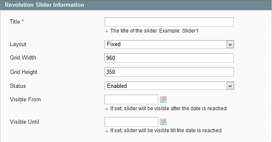
- Slider Title: An Internal used Name for the Slider. Only for Backend Usage
- Slider Layouts:
Fixed: A None Responsive Version of the Slider. Will have a prepared Width and height. Used for Older Themes
Custom: A Custom Grid system to set size of Slider per Browser Size. You can define different Levels for sizes. Only used for Frameworks where no Fluid Widths has been used. (i.e. Skeleton)
AutoResponsive: Used for Fluid Responsive themes, where the Slider calculates its own size for every Browser size. Only max width and height of Grid should be defined. In case the Container Width is not Boxed, it will go Fullwidth Automatically
FullScreen: Slider will take the height of Window and center the preset Grid within. It will always try to go FullHeight and Fullwidth if the wrapping container allows. Please be sure to set a minimum height on FullScreen setting. This will make sure that the Slider won't be really small in height on mobile devices and that it will have a height if it is not in the visible field on pageloading.
- Grid Settings: Depending on the Layout you can set the Width and Height of the Captions. The Slider will go Fullwdith or Fullwidth and Fullheight in case you set AutoResponsive or FullScreen. Caption Grid will be centered always within the slider container. In some cases (Custom) you can set multiple Levels depending on Screen Size. This is not needed in AutoResponsive and FullScreen mode. Fullscreen mode allows you to set a Container (per class or ID) whose height decreases the height of the FullScreen Slider Container automatically in every responsive level
- Status: Disabled will not show on frontend
- Visible From: Slider will show from this date
- Visible To: Slider will show until this date
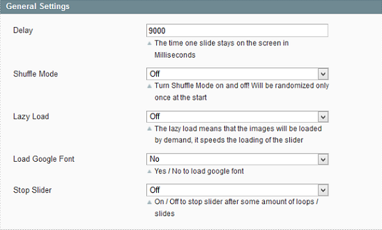
General
- Delay: Set the Delay Globaly for each slide. You can modify the Delay Time per Slide under the Edit Slide function.
- Shuffle Mode: Random Order of Slides on/off.
- Lazy Load: Use Dummy images during Document Load. Main images per slider are loaded on Demand when the slide is shown first time.
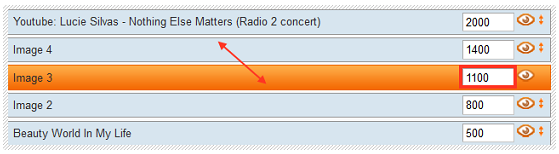
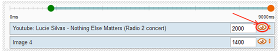
- Stop Slider: Use this setting to stop the Slider after a predefined Loop and at a predefined Slide. Loops 0 means in the first loop to stop and Stop at Slide 1 will stop directly at First slide. i.e. Stop After Loops 2 and Stop at Slide 3 will stop the slider after 2 Loops at the 3rd slide.
Google Fonts
· Used for Google Font Embedding in Slider. You can add unlimited Fonts here, all of them will be available in the CSS Editor.
· Visit The Google Font Page and search for your Font.
· Click on Quick Use and Select Standard Tab. Add this code into the textfield.
· To add more fonts, click on Add New (Screenshot).
· See also Caption HOW TO USE GOOGLE FONT later below
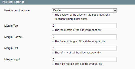
Position
- The Position of the Slider within the Container which is wrapping the slider.
Appearance
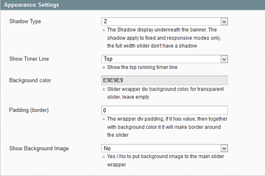
- Shadow Type: Choose between different Shadow Effects under the slider. Shadow Height is excluded of the Slide Height! You may need to set extra margin bottom via the Position Settings!
Navigation
- Touch Enabled: Turns on the Swipe function for navigation on mobile devices.
- Stop On Hover: Stops the Main slide Timer on Mouse Hover. Captions are still playing within the slide.
- Navigation Type: Set the Layout of navigation. Only Bullets, Bullets and Arrow, Thumbnails or None.
- Navigation Arrows: Choose between custom positions (solo) or Fixed position next to the bullets /thumbnails.
- Navigation Style: The Style / Art of the Navigation.
Thumbnails
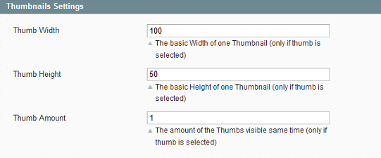
- Thumbnail Width and Height and shown Amount of Thumbs in same time. On Hover the Thumbs are scrolled
Mobile Visibility
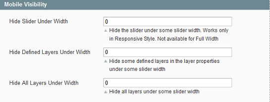
- Hide Slider Under Width: The Slider will be hidden and stopped if the Browser Size goes under this preset Size. Works only if Custom Sizes set to Slider.
- Hide Defined Layers under Width: Hides predefined Captions if the Browser Size is smaller than this predefined size. To hide Captions, go in the Slide Editor and turn on / off the option on the Captions one by one.
- Hide All Layers Under Width: Hides All Captions if the Browser Size is smaller than this predefined size.
- Hide Arrows/Bullets/Thumbnails on Mobile: Hides chosen navigation type if the Slider is viewed on a Mobile device.
Alternate First Slide
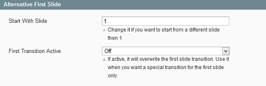
- You can set a different First Slide than the Slides Order use. You can set also a different First Transition then it defined in the Slide Editor to make sure that the first Transition is some Eye Catching animation, but later only use the Slide transitions i.e
Edit Slider
The next step is creating/editing slides. You get there by just clicking on Slides in the Revolution Slider Form window. Press Add Slide to create a new slide.
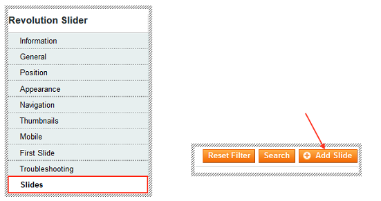
The New Slide tab automatically appears, as shown on the following screenshots.
General Slide Settings
The General Slide Settings lets you change many of the items that control how your slide is displayed, such as the title, Transitions, Slot Amount, Rotation, Thumbnail and Full Width Centering, etc.
- Slide Title: Uses only Internal Naming of the slides
- State: Published / Unpublished - used for editing/modifying the slide. If it is Unpublished, frontend will not show this slide at all.
- Transitions: The Animation Style for Slide’s appearance. You can select more than one from a multiple choice drop down list. Every new loop will use another Transition if you select more than one.
- Slot Amount: The Amount of Boxes / Slots the slides are divided into, during the animation.
- Rotation: The Rotation Degree on Simple Transitions. (-720 - 720, 999 = random)
- Transition Duration: The Duration of the Transition. (Default 300, min 100 max 2000 ms)
- Enable Link: It allows a Full width/height link on the Slide. You can set Link Target and Link URL here, or a Built in function like swap to slide X, Previous Slide, Next Slide
- Visible From/Until:
o If set, the Slide will only be visible between the set times.
o If Visible Until is not set, the Slide will be visible as soon as the Visible From date is reached.
o If Visible From is not set, the Slide will be visible until the Visible Until date is reached.
The Image Source for the Main Image
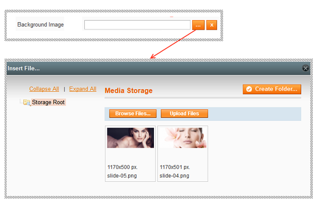
- A Slide can have an Image, Transparent Image, Solid Color or External Image as Main Image. This Image is the "Main Layer" in the background which has been animated via the General Settings predefined Transitions parameter.
Background Fit/Repeat/Position
- With these options, the chosen background image can be adjusted
Ken Burns Effect / Pan Zoom Effect
This effect is available only for Image BG and External URL
- Background Start Position defines the Position where the Ken Burns effect will start. This can be directly seen in the Drag & Drop Editor
- Background End Position defines the Position where the Ken Burns effect will end.
- Start Fit/End Fit defines the Pan Zoom the image will be at the Start/End. The Start Zoom can be directly seen in the Drag & Drop Editor
- Easing defines the easing the Background Image will have
- Duration defines the duration all the effects will take. Default is the Slide duration.
Text Layer
You can choose from following layers / captions: Text/HTML Markup, Image, Video
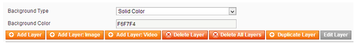
For individual TEXT / HTML Markup Layer click on Add Layer and follow the following settings:
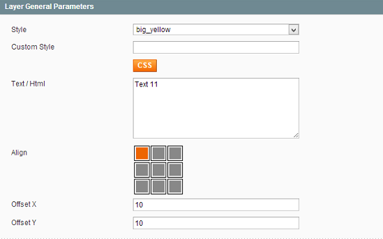
- To define a predefined Style or add your own Style use the Style Drop Down list. You can change the Styling of the captions / Layers via the CSS Editor (CSS button)
Use HTML5 Standard markups in case you wish to embed paragraphs, headings, buttons etc.
- Align: Set the Align of the Layers / Captions. Left Top is default. Drag and Drop move of the Layer will be based on the Align. If you set the Align to Center Center, the Drag and Drop will be based on this aligned position and use an Offset.
i.e. Center Center Offset X -100px Offset Y -100px will be used in every responsive size linear calculated. If the Screen size is scaled to 50% than the Item is still in the middle of the grid and offset is -50px -50px (linear calculated).
Layer Animation
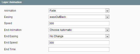
· Animation: The way the Caption appears on the screen. Select one of the Animation, Easing and Speed.
· End Animation: Optional. If not set, the Reverse Animation will be used as set in the Start Transition.
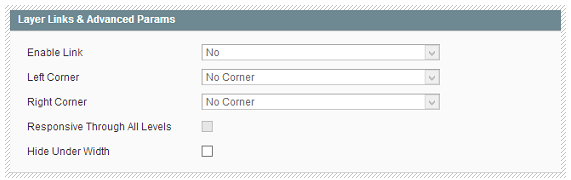
Layer Links & Advanced Params:
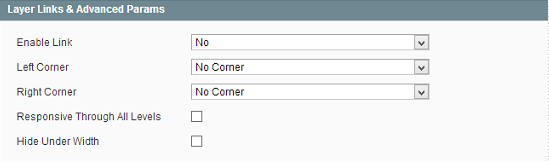
Left Corner / Right Corner
Draw a Sharp Corner of the Caption. Only works if Background Color has been set for Caption.
Responsive Through All Levels
If set, all HTML Containers within this Caption are resized linear to Slider Sizes. Default turned off, and only top level markup within Caption is resized
Hide Under Width
Hide Caption under a certain width. This is useful, to have a more clear slide on mobile devices i.e.
Image Layer
For an individual Image Layer, click on Add Layer: Image and follow the following settings:
- Upload an image: If you choose Image as a type of layer, click into the input of Image and upload an image or choose it from Media Library. After that you can add a link to this sublayer if you want.
- Change Image Source: Click on layer, you can use Edit Layer button to change image.
- Image Scaling: Change the Width/Height of the image, you can also scale the image proportionally.
Video Layer
You can also add a layer video by clicking into the input of Video Add Layer: Video. When using a Video Layer you should specify Youtube or Vimeo ID.
- Select video service: Select Youtube or Vimeo video
- Enter Video ID or URL: Set the Vimeo / YouTube Video ID here and Click the Search button.
- Width / Height: Set the Video Width and Height you wish to present your Embedded Video in the Slider
- FullWidth: If selected, Video will be Shown in FullWidth Mode (within the Grid!) on the Slider
- AutoPlay: If Slide is loaded, video will play automatically
- Autplay Only First Time: The video will only be played one single time automatically
- Hide Controls: If selected, the Video will not have control buttons. This should be used with the autoplay option or the customer? will probably not see that this video can be played.
- Force Rewind: Video will always play from the beginning each time the Slide is shown
- Next Slide on End: After Video has been played, next slide Transition starts automatically.
- Mute: Video will be muted
Video Layer Settings
Open the Video Setting Window as by Adding the Video Layer.
Align: Set the Align of the Layers / Captions. Left Top is default. Drag and Drop move of the Layer will be based on the Align. If you set the Align to Center Center, the Drag and Drop will be based on this aligned position and use an Offset.
- Layer Animation:
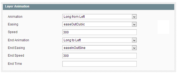
Animation: The way the Caption appears on the screen. Select one of 10 Animations from the drop-down list.
End Transition: Optional. If not set, the Reverse Animation will be used as set in the Start Transition.
In case the slide should stay all the time on the slide, but end animation should be different then Start animation, please select your End animation, and set End Time to the same as the Slide Delay. If no End Time set, End animation will be ignored !
- Layer Links & Advanced Params
Layer Sorting And Timing
Added layers appear in the list of Layer Sorting area beneath the slide preview area.
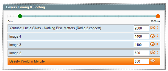
- Use drag’n'drop to move layers, change timeline:
- Edit visibility: click on the "eye" icon to hide / show the Layer from the Drag & Drop Section above, for easy Editing of the captions.
RevSlider Configuration
Please follow the instructions below to display your AM RevSlider.
You have 2 options A or B to install the AM RevSlider:
Option 1- AM RevSlider on CMS Page
This option allows you to set slideshow to be displayed on the homepage and other pages.
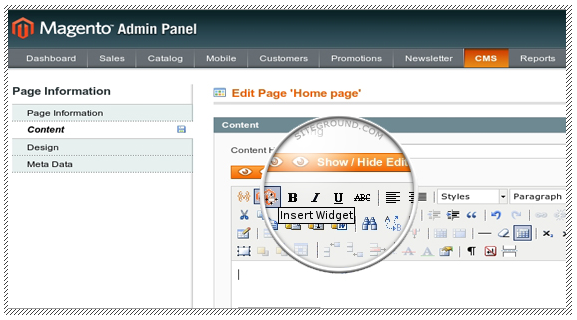
· Go to your admin panel > CMS > Pages.
· Click on the page or add a new page where you would like the RevSlider widget to appear, open the Content section and click on the Insert Widget icon.
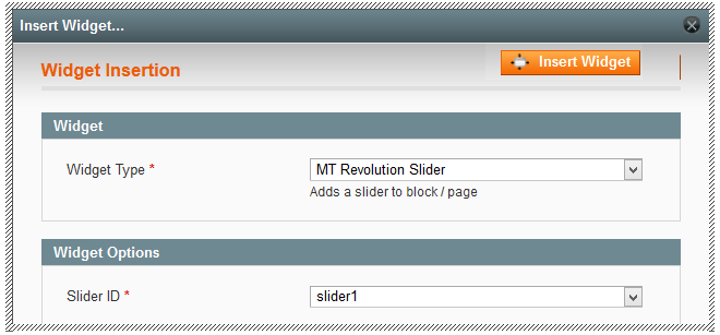
- A new pop-up will be opened. You can pick the Widget Type: AM Revolution Slider from the drop-down menu, and select Slider ID you want to display. Then click the Insert Widget button at the right side.
- After that, click the Save Page button to save and show AM Revolution Slider on the front-end.
Option 2- AM RevSlider on Static Block
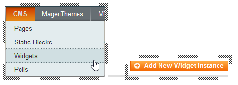
- Now, to display AM RevSlider on any Static Block, Go to the Widget admin under CMS > Widgets and Add NewWidget Instance.
- First, you will need to select AM Revolution Slider from the drop-down of Widget Type . Then you need to specify the design you want the widget to show up in. We chose default/default.
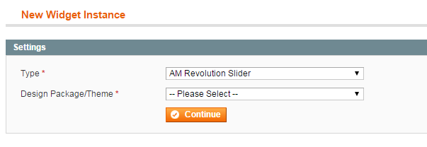
- Click the Continue button, then use settings specified in Frontend Properties and Widget Options.
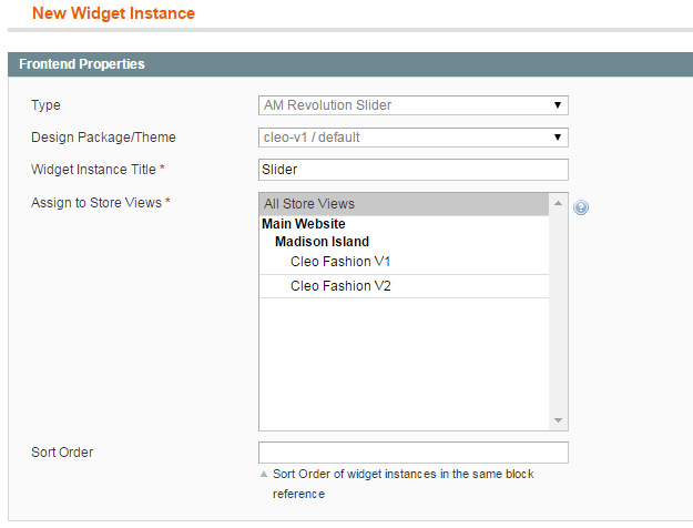
Some options you need to know:
- Widget Instance Title: Title of Widget
- Sort Order: Refers to the order the widget displays in if you have assigned several widgets to the same position in the template.
- Slider ID: The slider you want to display
Click on the Add Layout Update button and a new configuration section will appear. The first choice is the Display On drop-down.
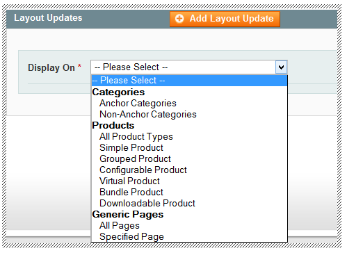
By default you have a general choice of Category, Products, Generic (CMS) pages and many sub-selections. You can select All Pages or one or more Specified Page where you want your widget instance to appear.
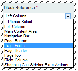
- The next choice is the block reference of the layout block where the widget instance is to be added to:
- Click the Save to Finish and go to your front-end to see how AM Revolution Slider is working!
Google Fonts
· Open the Slider Settings
· Click on the tab Google Font Settings
· Check "Yes" at Load Google Font
· Visit The Google Font Page and search for your Font (Screenshot)
· Click on Quick Use and look at the Select Tab. Add this code to your Google Font Settings Field (The google font families to load).
· Click on "Add New" to add unlimited fonts to the Slider.
· To integrate the font, copy the font-family settings from Google Font page and edit a Style, open the advanced tab and put it into there. For further details look at the CSS Editor part later on.
CSS Editor
To access the CSS Editor:
· Edit a slide
· Select a text layer
· Open the Layer General Parameters Tab
· Select the Edit Style button.
· Now you will see the style editor:
· Basic Styles can be easily changed through the Simple Option.
· Under Font - Family you will find here the earlier mentioned Fonts, you inserted at the Slider Settings Panel.
· For Advanced Settings, you can always open the Advanced Option and put all your CSS Styles for this CSS Class in here.
· Every change you do will be directly visible at the top. The example text will show how your style will be at the end!
· Delete Styles:
o To delete a Style, select it and click on Edit Style.
o Now click on Delete and confirm your deletion.
o Note: this can't be undone!
Import Export
· You can export slider date with Export button on Manage Slider page.
· Import slider with AM -> AM Revolution Slider -> Import menu.
Swiper Slider
Usage:
Here is the HTML Code for the Swiper Slider:
<section id="slider" class="slider-parallax swiper_wrapper full-screen clearfix">
	<div class="swiper-container">
	  <div class="swiper-wrapper">
		  <!--First Slide-->
		  <div class="swiper-slide">
			<!-- Any HTML content of the first slide goes here -->
		  </div>

		  <!--Second Slide-->
		  <div class="swiper-slide">
			<!-- Any HTML content of the second slide goes here -->
		  </div>

		  <!--Third Slide-->
		  <div class="swiper-slide">
			<!-- Any HTML content of the third slide goes here -->
		  </div>
		  <!--Etc..-->
	  </div>
	</div>
</section>
Note: You can use the "dark" class on .swiper-slide element, to make the Caption Content & the Header Scheme(only on Transparent Header) "Dark".
Setting Slider Height:
<div id="slider" class="slider-parallax swiper_wrapper clearfix" style="height: 400px;">
	...
</div>
Javascript:
<script>
	$(function(){
	  var mySwiper = $('.swiper-container').swiper({
		//Your options here:
		mode:'horizontal',
		loop: true
		//etc..
	  });
	});
</script>
Options:
| Parameter | Type | Default Value | Example | Description |
|---|---|---|---|---|
| speed | number | 300 | 600 | duration of animation between slides (in ms) |
| eventTarget | string | 'wrapper' | 'container' | Event target for swipes, by default all touch events are used on wrapper. Useful to switch it to 'container' if you have some other elements inside of container and you want to keep swipes on them. |
| autoplay | number | 5000 | - | delay between transitions (in ms). If this parameter is not specified, auto play will be disabled |
| autoplayDisableOnInteraction | boolean | true | false | Set to false and autoplay will not be disabled after user interactions(swipes, arrow and pagination clicks), it will be restarted every time after interaction. |
| autoplayStopOnLast | boolean | false | true | Set to false and autoplay will be disabled on last slide (works only with disabled loop). |
| mode | string | 'horizontal' | 'vertical' | slides will be positioned horizontally (for horizontal swipes) or vertically (for vertical swipes) |
| loop | boolean | false | true | Set to true to enable loop mode. |
| loopAdditionalSlides | number | 0 | 2 | Addition number of slides that will be cloned after creating of loop. |
| loopedSlides | number | 1 | 2 | If you use slidesPerView:'auto' with loop mode you should tell to Swiper Slider how many slides it should "loop" using this parameter. |
| slidesPerView |
number or 'auto' |
1 | 4 | Set numbers of slides you want to display at the same time on slider's container for carousel mode. Also supports for 'auto' value, in this case it will fit slides depending on container's width. 'auto' mode doesn't compatible with loop mode. |
| slidesPerViewFit | boolean | true | false | Will make effect only with slidesPerView:'auto' and if you have slides that are wider than container. When true (by default) then large slide transition will be divided on two part on its edge positions. When false - slide transition will be divided as many parts as slide larger than container. |
| slidesPerGroup | number | 1 | 2 | Set numbers of slides to define and enable group sliding. Useful to use with carousel mode. |
| calculateHeight | boolean | false | true | Set to true and Swiper Slider will calculate container's height depending on slides content. Useful in repsonsive layout or when you don't know height of your slides (like with responsive images). |
| roundLengths | boolean | false | true | Set to true and Swiper Slider will round width/height values, may be useful if you have rounding errors (like 833.48px width) in responsive swiper. |
| cssWidthAndHeight | boolean | false | true | Set to true and Swiper Slider will not set width and height to container, wrapper and slides. |
| updateOnImagesReady | boolean | true | false | When enabled Swiper Slider will be reinitialized after all inner images (<img> tags) are loaded. . |
| releaseFormElements | boolean | true | false | This option allows to use form elements in Swiper Slider and disable swiping on them. . |
| watchActiveIndex | boolean | false | true | If enabled the Swipe recalculates activeIndex dynamically during touch interactions . |
| visibilityFullFit | boolean | false | true | If enabled then "visible" slides will be only those slides that are entirely fit to the container's view. . |
| autoResize | boolean | true | false | Set to false if you want to disable automatic slider resize on window resize. . |
| resizeReInit | boolean | false | true | If "true" then Swiper Slider will be always reinitialized with window resize. . |
| DOMAnimation | boolean | true | false | Enable/disable custom DOM animation in browsers that don't support css transitions (like IE7-9). . |
| resistance |
boolean or '100%' |
true | false | Set to false if you want to disable resistant bounds. Set to '100%' to enable nopeek resistance mode. . |
| noSwiping | boolean | false | true | If true, then you can add "noSwipingClass" class to swiper's slide to prevent/disable swiping on this element. . |
| preventLinks | boolean | true | false | When enabled Swiper Slider will prevent clicks on links (<a>) while slider is "touching". |
| preventLinksPropagation | boolean | false | true | Set to true if you want to do stopPropagation along with preventLinks during swipes. |
| initialSlide | number | 2 | 0 | Index number of initial slide. |
| useCSS3Transforms | boolean | true | false | Set to false if you don't want to use css3 transforms for slides offset (could improve quality, but could reduce performance) to use wrapper's left/top properties instead. |
| Free Mode and Scroll Container | ||||
| freeMode | boolean | false | true | If 'true' then slides will not have fixed positions |
| freeModeFluid | boolean | false | true | If true, then if you release the slide it will keep moving for a while |
| scrollContainer | boolean | false | true | Set to true if you want to use Swiper Slider like a scrollable area. |
| momentumRatio | number | 1 | 2 | Higher value produces larger momentum distance after you release slider. |
| momentumBounce | boolean | true | false | Set to false if you want to disable momentum bounce in free mode. |
| momentumBounceRatio | number | 1 | 2 | Higher value produces larger momentum bounce effect. |
| Slides offset | ||||
| centeredSlides | boolean | false | true | If true, then active slide will be centered, not always on the left side. . |
| offsetPxBefore | number | 0 | 100 | Slides will have specified offset value from the left "border" of wrapper . |
| offsetPxAfter | number | 0 | 100 | Slides will have specified offset value from the right "border" of wrapper . |
| offsetSlidesBefore | number | 0 | 2 | Slides will have offset from the left "border" of wrapper that equal to the specified number of slides' widths. Useful in responsive layouts when you don't know slide's width . |
| offsetSlidesAfter | number | 0 | 2 | Slides will have offset from the right "border" of wrapper that equal to the specified number of slides' widths. Useful in responsive layouts when you don't know slide's width . |
| Touch/mouse interactions | ||||
| touchRatio | number | 1 | 0.8 | Touch ratio |
| simulateTouch | boolean | true | false | If true, Swiper Slider will accept mouse events like touch events (click and drag to change slides) |
| onlyExternal | boolean | false | true | If true, then the only way to switch the slide is use of external API functions like swipeRight or swipeLeft. Useful for tabs like in example above |
| followFinger | boolean | true | false | If false, then slider will be animated only when you release it, it will not move while you hold your finger on it |
| grabCursor | boolean | false | true | This option may a little improve usability of your swiper users. If true, user will see the "grab" cursor when hover on Swiper Slider. |
| shortSwipes | boolean | true | false | Set to false if you want to disable short swipes. |
| longSwipesRatio | number | 0.5 | 0.3 | Ratio to trigger swipe to next/previous slide during long swipes. |
| moveStartThreshold | number | false | 100 | Threshold value in px. If "touch distance" will be lower than this value then swiper will not move. |
| swipeToNext | boolean | true | false | Set to false to disable swiping to next direction (to right or bottom)New in 2.7.0 |
| swipeToPrev | boolean | true | false | Set to false to disable swiping to prev direction (to left or top)New in 2.7.0 |
| Navigation | ||||
| keyboardControl | boolean | false | true | Set to true to enable navigation through slides using keyboard right and left (for horizontal mode), top and borrom (for vertical mode) keyboard arrows |
| mousewheelControl | boolean | false | true | Set to true to enable navigation through slides using mouse wheel. |
| mousewheelControlForceToAxis | boolean | false | true | Set to true to force mousewheel swipes to axis. So in horizontal mode mousewheel will work only with horizontal mousewheel scrolling, and only with vertical scrolling in vertical mode. |
| Pagination | ||||
| pagination | string or HTML Element | - | '.my-pagination' | CSS selector of the container with pagination. Or HTML element of pagination element. |
| paginationClickable | boolean | false | true | If true then clicking on pagination button will cause transition to appropriate slide. . |
| paginationAsRange | boolean | true | If true then pagination buttons that are related to visible slides will have additional css class. Useful when using slidesPerView more than 1. . | |
| createPagination | boolean | true | false | if true, then Swiper Slider will create as many SPAN elements as many slides in slider. All these spans will be created in the container specified in the "pagination" parameter. Every SPAN will have a 'swiper-pagination-switch' class, active span (of the current slide) will have a 'swiper-active-switch' class. They will be useful for styling them. |
| Namespace | ||||
| wrapperClass | string | 'swiper-wrapper' | 'my-wrapper' | CSS class of the Swiper Slider's wrapper. See the HTML demo above |
| slideClass | string | 'swiper-slide' | 'my-slide' | CSS class of the Swiper Slider's slide. See the HTML demo above |
| slideActiveClass | string | 'swiper-slide-active' | 'my-active-slide' | CSS class of the Swiper Slider's active slide. . |
| slideVisibleClass | string | 'swiper-slide-visible' | 'my-visible-slide' | CSS class of the Swiper Slider's visible slide. . |
| slideElement | string | 'div' | 'li' | Name of tag that you use for single slide. |
| noSwipingClass | string | 'swiper-no-swiping' | 'stop-swiping' | CSS class of html element that will be used to prevent swiping when "noSwiping" parameter is set to true. . |
| paginationElement | string | 'span' | 'div' | Name of tag that you use for single pagination button. |
| paginationElementClass | string | 'swiper-pagination-switch' | 'my-switch' | CSS class of the Swiper Slider's pagination switch. . |
| paginationActiveClass | string | 'swiper-active-switch' | 'my-active-switch' | CSS class of the Swiper Slider's active pagination switch. |
| paginationVisibleClass | string | 'swiper-visible-switch' | 'my-visible-switch' | CSS class of the Swiper Slider's visible pagination switch. . |
| Callbacks | ||||
| queueStartCallbacks | boolean | false | true | Set to "true" if you want to queue "slideChangeStart" callbacks. In this case callback will be fired only once during fast multiple swipes/transitions. . |
| queueEndCallbacks | boolean | false | true | Set to "true" if you want to queue "slideChangeEnd" callbacks. In this case callback will be fired only once after fast multiple swipes/transitions. . |
| onFirstInit | function | - | function(swiper){ do something } | Callback function, will be executed right after first initialization. |
| onInit | function | - | function(swiper){ do something } | Callback function, will be executed right after all others initializations/re-intializations. |
| onSwiperCreated | function | - | function(swiper){ do something } | Callback function, when Swiper Slider is fully initialized, after creation of loop, pagination, etc. |
| onTouchStart | function | - | function(swiper){ do something } | Callback function, will be executed when you touch the slider |
| onTouchMove | function | - | function(swiper){ do something } | Callback function, will be executed when you touch and move finger over the slider |
| onTouchEnd | function | - | function(swiper){ do something } | Callback function, will be executed when you release the slider |
| onSlideReset | function | - | function(swiper){ do something } | Callback function, will be executed when you release the slide and it going to be reseted to currently active slide. Don't work with freeMode. |
| onSlideChangeStart | function | - | function(swiper, direction){ do something } | Callback function, will be executed in the beginning of animation to other slide (next or previous). Don't work with freeMode. |
| onSlideChangeEnd | function | - | function(swiper, direction){ do something } | Callback function, will be executed after animation to other slide (next or previous). Don't work with freeMode. |
| onSlideNext | function | - | function(swiper){ do something } | Callback function, the same as onSlideChangeStart but only for forward direction. |
| onSlidePrev | function | - | function(swiper){ do something } | Callback function, the same as onSlideChangeStart but only for backward direction. |
| onSlideClick | function | - | function(swiper){ do something } | Callback function, will be executed after you click any slide. |
| onSlideTouch | function | - | function(swiper){ do something } | Callback function, will be executed right after you touch any slide. Almost the same as onTouchStart , but also returns .clickedSlide and.clikedSlideIndex values. |
| onImagesReady | function | - | function(swiper){ do something } | Callback function, will be executed right after all inner images are loaded. "updateOnImagesReady" should be also set to "true". . |
| onMomentumBounce | function | - | function(swiper){ do something } | Callback function, will be executed on momentum bounce. . |
| onResistanceBefore | function | - | function(swiper,p){ do something } | Callback function, will be executed during negative resistance. p - returns resistance distance. . |
| onResistanceAfter | function | - | function(swiper,p){ do something } | Callback function, will be executed during positive resistance. p - returns resistance distance. . |
| onSetWrapperTransition | function | - | function(swiper, duration){ do something } | Callback function, will be executed everytime when swiper starts animation. |
| onSetWrapperTransform | function | - | function(swiper, transform){ do something } | Callback function, will be executed when swiper's wrapper change its position. p - returns object with current transform offset. |
You can find more Swiper Slider related Documentation here.
Swiper Slider Documentation
Slider Captions
You can Add Captions to your Slides using a no. of Classes described below:
| Caption Class | Description | Works on |
|---|---|---|
.slider-caption |
Creates a Caption on the Slider | Swiper Slider |
.flex-caption |
Creates a Caption on Flex Slider, Owl Slider & Camera Slider |
Flex Slider Owl Slider Camera Slider with .camera-caption |
.nivo-caption |
Creates a Caption on the Nivo Slider | Nivo Slider |
.ei-title |
Creates a Caption on the Elastic Slider | Elastic Slider |
.slider-caption-right |
Positions the Caption to the Right on the Swiper Slider | Swiper Slider |
.slider-caption-center |
Positions the Caption in the Center on the Swiper Slider | Swiper Slider |
.slider-caption-top-left |
Positions the Caption to the Top Left on Flex Slider & Owl Slider |
Flex Slider Owl Slider |
.slider-caption-top-right |
Positions the Caption to the Top Right on Flex Slider & Owl Slider |
Flex Slider Owl Slider |
.slider-caption-bottom-right |
Positions the Caption to the Bottom Right on Flex Slider & Owl Slider |
Flex Slider Owl Slider |
.slider-caption-bg |
Provides a Dark background for the Caption on Flex Slider, Owl Slider & Camera Slider |
Flex Slider Owl Slider Camera Slider with .camera-caption |
.slider-caption-bg.slider-caption-bg-light |
Provides a Light background for the Caption on Flex Slider, Owl Slider & Camera Slider |
Flex Slider Owl Slider Camera Slider with .camera-caption |
Slider Helper Classes
We have created some helper classes for the Sliders. Here are a few of them:
-
.slider-parallax- Enables Parallax Functionality for the Slider Element. -
.boxed-slider- Makes the Slider Boxed within the Container. -
.full-screen- Makes the Slider Full Screen. -
.with-header- Makes the Slider Full Screen with Header Height included..full-screenclass should also be included.
Features
Rich Snippets
Go to WeltPixel -> Schema -> Rich Snippets
- Enable Rich Snippets - [ Yes / No ]
- Use Long Descriptions - [ Yes / No ]
- Wrap with div (Helps prevent conflicts with SEO extensions) - [ Yes / No ]
Facebook Open Graph
Go to WeltPixel -> Schema -> Facebook Open Graph
- Enable Facebook Open Graph - [ Yes / No ]
- Use Long Descriptions - [ Yes / No ]
Pinterest Rich Pins
Go to WeltPixel -> Schema -> Pinterest Rich Pins
- Enable Printerest Rich Pins - [ Yes / No ] - it uses same tags as Facebook Open graph, make sure Facebook Open Graph is enabled as well
Twitter Product Cards
Go to WeltPixel -> Schema -> Twitter Product Cards
- Enable Twitter Product Cards - [ Yes / No ]
- Use Long Descriptions - [ Yes / No ]
- Twitter Site - [ text ] - @username for the website used in the card footer.
- Twitter Creator - [ text ] - @username for the content creator / author.
Animations
Scroll to reveal Animations are latest in the Trends. You can do them too with Cleo. You can use animations on any element you want. Here is the Sample Code:
<div data-animate="fadeInLeft"></div>
You can also use delays for your Animations:
<div data-animate="fadeInLeft" data-delay="500"></div>
Note: Delay Duration is in milliseconds.
Here is the list of the Animation Types you can use:
-
bounce -
flash -
pulse -
rubberBand -
shake -
swing -
tada -
wobble -
bounceIn -
bounceInDown -
bounceInLeft -
bounceInRight -
bounceInUp -
bounceOut -
bounceOutDown -
bounceOutLeft -
bounceOutRight -
bounceOutUp -
fadeIn -
fadeInDown -
fadeInDownBig -
fadeInLeft -
fadeInLeftBig -
fadeInRight -
fadeInRightBig -
fadeInUp -
fadeInUpBig -
fadeOut -
fadeOutDown -
fadeOutDownBig -
fadeOutLeft -
fadeOutLeftBig -
fadeOutRight -
fadeOutRightBig -
fadeOutUp -
fadeOutUpBig -
flip -
flipInX -
flipInY -
flipOutX -
flipOutY -
lightSpeedIn -
lightSpeedOut -
rotateIn -
rotateInDownLeft -
rotateInDownRight -
rotateInUpLeft -
rotateInUpRight -
rotateOut -
rotateOutDownLeft -
rotateOutDownRight -
rotateOutUpLeft -
rotateOutUpRight -
hinge -
rollIn -
rollOut -
zoomIn -
zoomInDown -
zoomInLeft -
zoomInRight -
zoomInUp -
zoomOut -
zoomOutDown -
zoomOutLeft -
zoomOutRight -
zoomOutUp
Sections & Parallax
Setup content you want to stand out. You can use Light & Dark Sections, Parallax Images or HTML5 Videos as Sections.
Setting up Sections:
Setup your Sections outside the .container element.
Light Section:
<div class="section">
	<div class="container clearfix">

		...

	</div>
</div>
Dark Section:
<div class="section dark">
	<div class="container clearfix">

		...

	</div>
</div>
Setting up Parallax Sections:
Make sure your Parallax Images are of enough Width & Height, preferably 1920x1080 or above.
<div class="section parallax" style="background: url('images/parallax/3.jpg') center center; background-size:cover; padding: 100px 0;" data-stellar-background-ratio="0.3">
	<div class="container clearfix">

		...

	</div>
</div>
Note: If you are experiencing Background Image Repeat in a Parallax Section, then you should use data-stellar-vertical-offset="150" to avoid this. You can change 150 to your desired value.
Setting up HTML5 Video Sections:
You'll need an HD .mp4 & .webm videos.
<div class="section dark" style="height: 550px;">

	<div class="container clearfix">

		...

	</div>

	<div class="video-wrap">
		<video poster="images/videos/deskwork.jpg" preload="auto" loop autoplay muted>
			<source src='images/videos/deskwork.mp4' type='video/mp4' />
			<source src='images/videos/deskwork.webm' type='video/webm' />
		</video>
		<div class="video-overlay"></div>
	</div>

</div>
Setting up Youtube Background Video Sections:
You can now simply Add Youtube Video as Background Sections similar to the HTML5 Video Sections.
<div class="section yt-bg-player nomargin dark" data-quality="hd1080" data-start="20" data-stop="40" data-video="http://youtu.be/A3PDXmYoF5U" style="height: 600px;">
	<div class="container clearfix">

		...

	</div>
</div>
List of the Youtube Background Video Options:
-
data-video- The Youtube Video Share URL. Example: http://youtu.be/BCqJGoCMlVc -
data-mute- Mute the Audio. Example: true or false -
data-ratio- Aspect Ratio of the Video. Example: "4/3" or "16/9" -
data-quality- Quality of the Video. Example: "default" or "small", "medium", "large", "hd720", "hd1080", "highres" -
data-opacity- Opacity of the Video. Example: -
data-container- CSS selector of the DOM element where you want the video background, if not specified it takes the "self". -
data-optimize- Will fit the video size into the window size optimizing the view. Example: true or false -
data-loop- Loops the Video. Example: true or false -
data-volume- Volume of the Audio. Example: 1 to 100 -
data-start- Set the seconds the video should start at. Example: 10 -
data-stop- Set the seconds the video should stop at. Example: 30. (If set 0, the video will play till the end) -
data-autoplay- Autoplay the Video. Example: true or false -
data-fullscreen- Activate the new HTML5 full screen behavior. Example: true or false
Tabs
You can use Tabs, Toggles & Accordions in Various Styles and with Different Options to display Below the Fold content.
Tabs
Use the below code to display Tabs:
<div class="tabs clearfix" id="tabs">

	<ul class="tab-nav clearfix">
		<li><a href="#tab-1">Tab 1</a></li>
		<li><a href="#tab-2">Tab 2</a></li>
		<li><a href="#tab-3">Tab 3</a></li>
	</ul>

	<div class="tab-container">

		<div class="tab-content clearfix" id="tab-1">
			This is Tab 1 Content
		</div>
		<div class="tab-content clearfix" id="tab-2">
			This is Tab 2 Content
		</div>
		<div class="tab-content clearfix" id="tab-3">
			This is Tab 3 Content
		</div>

	</div>

</div>
Note: Make sure you add unique IDs for each Tab Container and Tab Items.
Options:
-
data-speed- The Fade Effect speed for switching between Tabs. Eg. 400 for 0.4 Seconds -
data-active- The Order Number of the Tab which you want to activate on initialization. Eg. 2 to activate the Second Tab on Initialization
Example:
<div class="tabs clearfix" id="tabs" data-speed="700" data-active="2">

	<ul class="tab-nav clearfix">
		<li><a href="#tab-1">Tab 1</a></li>
		<li><a href="#tab-2">Tab 2</a></li>
		<li><a href="#tab-3">Tab 3</a></li>
	</ul>

	<div class="tab-container">

		<div class="tab-content clearfix" id="tab-1">
			This is Tab 1 Content
		</div>
		<div class="tab-content clearfix" id="tab-2">
			This is Tab 2 Content
		</div>
		<div class="tab-content clearfix" id="tab-3">
			This is Tab 3 Content
		</div>

	</div>

</div>
Initializing Tabs using Custom Javascript
Tabs are initialized using the Standard Minimal Functionality by default, but there might instances when you would have to Create a Custom Functionality for the Tabs using some more options of the jQuery UI Tabs Plugin. To use this you can simply add the.customjs Class to .tabs Container as this will stop it from using the Default Functionality and allow you to extend the Tabs with your own Custom Functionality. Here is an example:
<div class="tabs customjs clearfix" id="tabs">

	<ul class="tab-nav clearfix">
		<li><a href="#tab-1">Tab 1</a></li>
		<li><a href="#tab-2">Tab 2</a></li>
		<li><a href="#tab-3">Tab 3</a></li>
	</ul>

	<div class="tab-container">

		<div class="tab-content clearfix" id="tab-1">
			This is Tab 1 Content
		</div>
		<div class="tab-content clearfix" id="tab-2">
			This is Tab 2 Content
		</div>
		<div class="tab-content clearfix" id="tab-3">
			This is Tab 3 Content
		</div>

	</div>

</div>

<script>
	jQuery(document).ready( function($){
		$( "#tabs" ).tabs({
			collapsible: true,
			event: 'mouseover',
			show: {
				effect: "fade",
				duration: 400
			}
		});
	});
</script>
Full list of Customizable Options can be found at the jQuery UI Tabs API.
Responsive Slider
You can add a Responsive Slider on any Page using the Code below:
<div class="fslider">
	<div class="flexslider">
		<div class="slider-wrap">
			<div class="slide"><img src="slide-image.jpg" alt="Slide 1"></div>
			<div class="slide"><img src="slide-image.jpg" alt="Slide 2"></div>
			<div class="slide"><img src="slide-image.jpg" alt="Slide 3"></div>
		</div>
	</div>
</div>
There are Definable Options which can be used to change the Look & Feel of your Sliders:
-
data-animation- Defines the Animation Style of the Slider. Use slide or fade -
data-easing- Easing of the Slide Animation. Eg.easeInQuad -
data-direction- Direction of the Slide Animation. Use horizontal or vertical -
data-slideshow- Enables/Disables Auto Slideshow. Set to true or false -
data-pause- Time Interval between Slide Animations when Auto Slideshow enabled in milliseconds. Eg. 5000 for 5 Seconds -
data-speed- Speed of the Slide Animation in milliseconds. Eg. 600 for 0.6 Seconds -
data-video- Set to true if a Slide in the Slider contains a Embedded Video -
data-pagi- Enables/Disables Slider's Pagination. Set to true or false -
data-arrows- Enables/Disables Slider's Arrow Navigation. Set to true or false -
data-thumbs- Enables/Disables Slider's Thumb Navigation. Set to true or false. Note: If this is set to true, then you will need to includedata-thumbfor Each Slide. Eg.data-thumb="your-slide-thumb-image.jpg"
Using Thumbs Scaling
You can use the Scaling Thumbs feature to divide the Thumb's Width into equal widths relative to the Slider's Width. For Example, if your Slider's Width is 800px, then the Thumb's Width for a 4 Columns Grid will be 200px and for a 8 Columns Grid will be 100pxand so on...
<div class="fslider flex-thumb-grid grid-6" data-arrows="false" data-animation="fade" data-thumbs="true">
	<div class="flexslider">
		<div class="slider-wrap">
			<div class="slide" data-thumb="slide-thumb-image.jpg"><img src="slide-image.jpg" alt="Slide Image"></div>
			<div class="slide" data-thumb="slide-thumb-image.jpg"><img src="slide-image.jpg" alt="Slide Image"></div>
			<div class="slide" data-thumb="slide-thumb-image.jpg"><img src="slide-image.jpg" alt="Slide Image"></div>
			<div class="slide" data-thumb="slide-thumb-image.jpg"><img src="slide-image.jpg" alt="Slide Image"></div>
			<div class="slide" data-thumb="slide-thumb-image.jpg"><img src="slide-image.jpg" alt="Slide Image"></div>
			<div class="slide" data-thumb="slide-thumb-image.jpg"><img src="slide-image.jpg" alt="Slide Image"></div>
		</div>
	</div>
</div>
You can use grid-3, grid-5, grid-6, grid-8, grid-10, grid-12 for your Thumbs Grid.
Note: You will need to add the .flex-thumb-grid Class to the .fslider Element along with the Grid's Class. Also, there is no need to use any Class for a 4 Columns Grid since it is set by default.
Lightbox & Notifications
Setting up Lightboxes:
Adding a data-lightbox attribute to any Link or Button will turn it into a Lightbox Element. You can use different Types of Lightbox with an Easy Setup:
Single Image:
<a href="link-to-lightbox-image.jpg" data-lightbox="image"><img src="link-to-small-thumb.jpg" alt="Lightbox Image"></a>
Iframe:
<a href="http://yourwebsite.com" data-lightbox="iframe">Your Website in a Lightbox</a>
Video:
<a href="http://www.youtube.com/watch?v=kuceVNBTJio" data-lightbox="iframe">Lightbox Video</a>
Note: It is recommended that you use only this Format http://www.youtube.com/watch?v=kuceVNBTJio for Youtube Videos.
AJAX:
<a href="link-to-ajax-content.html" data-lightbox="ajax">AJAX Content in a Lightbox</a>
Note: It is recommended that you use the .portfolio-ajax-modal Class to wrap your AJAX Content to get it displayed properly. You can also design your AJAX Content in any way using your own Custom CSS.
Gallery:
<div data-lightbox="gallery">
	<a href="link-to-lightbox-image.jpg" data-lightbox="gallery-item"><img src="link-to-small-thumb.jpg" alt="Lightbox Image"></a>
	<a href="link-to-lightbox-image.jpg" data-lightbox="gallery-item"><img src="link-to-small-thumb.jpg" alt="Lightbox Image"></a>
	<a href="link-to-lightbox-image.jpg" data-lightbox="gallery-item"><img src="link-to-small-thumb.jpg" alt="Lightbox Image"></a>
	<a href="link-to-lightbox-image.jpg" data-lightbox="gallery-item"><img src="link-to-small-thumb.jpg" alt="Lightbox Image"></a>
	<a href="link-to-lightbox-image.jpg" data-lightbox="gallery-item"><img src="link-to-small-thumb.jpg" alt="Lightbox Image"></a>
</div>
AJAX Gallery:
<div data-lightbox="ajax-gallery">
	<a href="link-to-ajax-content.html" data-lightbox="ajax-gallery-item">AJAX Content in a Lightbox</a>
	<a href="link-to-ajax-content.html" data-lightbox="ajax-gallery-item">AJAX Content in a Lightbox</a>
	<a href="link-to-ajax-content.html" data-lightbox="ajax-gallery-item">AJAX Content in a Lightbox</a>
	<a href="link-to-ajax-content.html" data-lightbox="ajax-gallery-item">AJAX Content in a Lightbox</a>
	<a href="link-to-ajax-content.html" data-lightbox="ajax-gallery-item">AJAX Content in a Lightbox</a>
</div>
Showing Lightbox Captions:
To show Captions for your Lightbox Images you will need to add the title Attribute for your Lightbox Links:
<a href="link-to-lightbox-image.jpg" data-lightbox="image" title="Lightbox Image"><img src="link-to-small-thumb.jpg" alt="Lightbox Image"></a>
Setting up Notifications:
You can setup Custom Notifications for your Website to get attention of your Visitors. A Sample Code to trigger a Notification:
<a href="#" class="btn btn-info" data-notify-type="info" data-notify-msg="<i class=icon-info-sign></i> Welcome to Cleo Demo!" onclick="SEMICOLON.widget.notifications(this); return false;">Show Info</a>
The Notification Shortcode has the following customizable options:
-
data-notify-position- Defines the Position of the Notification Message. Definable Options are as follows:- top-right - Shows the Notification Message at the Top Right corner of the screen
- top-left - Shows the Notification Message at the Top Left corner of the screen
- bottom-right - Shows the Notification Message at the Bottom Right corner of the screen
- bottom-left - Shows the Notification Message at the Bottom Left corner of the screen
- top-full-width - Shows the Notification Message at the Top in a Full Width Layout
- bottom-full-width - Shows the Notification Message at the Bottom in a Full Width Layout
-
data-notify-type- Defines the Type/Color of the Notification Message. Definable Options are as follows:- info
- error
- success
- warning
-
data-notify-msg- Sets the Content of the Notification Message in HTML. Eg.<i class=icon-info-sign></i> Welcome to Cleo Demo! -
data-notify-close- Shows a Close Button in the Notification Box. Use true or false
You can also Trigger a Custom Notification on a User Defined Action such as Form Submission or Window Load. Here is a Sample Code to achieve this:
<div id="custom-notification-message" data-notify-position="top-right" data-notify-type="info" data-notify-msg="<i class="icon-info-sign"></i> Welcome to Cleo Demo!"></div>

<script type="text/javascript">
	jQuery(window).load( function(){
		SEMICOLON.widget.notifications( jQuery('#custom-notification-message') );
	});
</script>
Note: Remember, SEMICOLON.widget.notifications(); Function only accepts jQuery Selector to get executed properly. So you can turn any HTML Element with a Unique ID to a Notification Element using the Settings mentioned above and call the Notification Function on its HTML ID Selector.
Counters
You can add a Countdown Timer to any Page using the following setup:
<div id="countdown-example"></div>

<script>
	jQuery(document).ready( function($){
		var newDate = new Date(2015, 5, 15);
		$('#countdown-example').countdown({until: newDate});
	});
</script>
Also, the date is in Javascript Format: (YYYY, M, DD) and the Javascript formats the Month as following:
- 0 as January
- 1 as February
- 2 as March
- 3 as April
- 4 as May
- 5 as June
- 6 as July
- 7 as August
- 8 as September
- 9 as October
- 10 as November
- 11 as December
So if you want your Countdown Date to be setup on 15th June, 2015 then your Countdown Date in Javascript Format will beDate(2015, 5, 15).
Flickr Widget
You can show your Flickr Photos from a Username or Group anywhere on your website, simply by writing a Single Line of Code. Some of the important attributes you'll require while setting up this widget are listed below:
-
data-id- The ID of your Username/Group. Can be obtained from here. Example: 613394@N22 -
data-count- No. of Images you want to be retrieved. Example: 12 -
data-type- Type of the ID you have entered. Example: group/user
Code Sample:
<div id="flickr-widget" class="flickr-feed masonry-thumbs" data-id="613394@N22" data-count="16" data-type="group" data-lightbox="gallery"></div>
Dribbble Widget
You can show your Dribbble Shots from a Username anywhere on your website, simply by writing a Single Line of Code. Some of the important attributes you'll require while setting up this widget are listed below:
-
data-user- The Username from which you want to retrieve shots. You'll need to provide a username only if yourdata-typeis user/follows. Example: envato -
data-count- No. of Images you want to be retrieved. Example: 12 -
data-type- Type of the Shots you want to retrieve. Example: user/follows/list -
data-list- Type of List you want to retrieve. You'll need to provide this only if yourdata-typeis list. Example: popular/everyone/debuts
Code Sample:
<div id="dribbble-widget" class="dribbble-shots masonry-thumbs" data-user="envato" data-count="16" data-type="user"></div>
Instagram Widget
You can show your Instagram Photos from a Username/Tags anywhere on your website, simply by writing a Single Line of Code. Some of the important attributes you'll require while setting up this widget are listed below:
-
data-user- The Username from which you want to retrieve shots. You'll need to provide a username only if yourdata-typeis user. Example: envato -
data-count- No. of Images you want to be retrieved. Example: 12 -
data-type- Type of the Photos you want to retrieve. Example: user/tag/popular -
data-tag- Tag of the Photos you want to retireve. You'll need to provide a tag only if yourdata-typeis tag. Example: beautiful/nature/morning etc.
Code Sample:
<div id="instagram-widget" class="instagram-photos masonry-thumbs" data-user="envato" data-count="16" data-type="user"></div>
Instagram Widget
To display the Instagram widget in your homepage you must set your Instagram username and authorize the widget to use your account.
-
Steps to have the instagram widget:
In admin CMS -> Pages -> select your homepage and click Content tab
Replace HereYourUsername with your Instagram username <div id="instagram-widget" class="instagram-photos masonry-thumbs coll-5" data-user="HereYourUsername" data-count="5" data-type="user"></div>
-
Go to http://instagram.com/developer. Login to your account or create one. Then click on Manage Clients, and finally on Register a New Client.
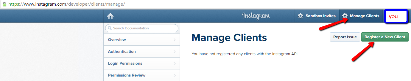
-
Fill out the Application Name, Description, Website(which should be your website) . Fill our http://localhost in the field Valid redirect URIs and press enter to confirm that field.
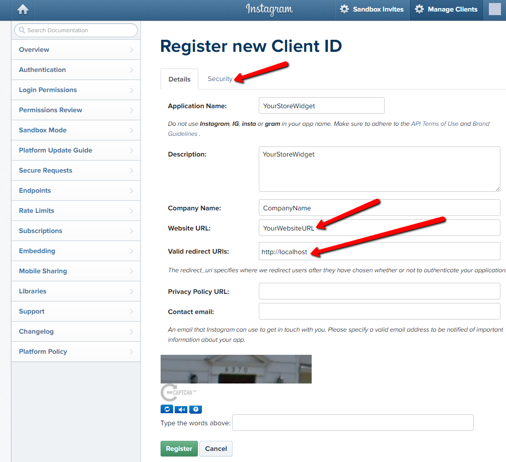
-
In Security tab DO NOT CHECK Disable implicit OAuth or Enforce signed requests.
-
Now you should see a Success message as seen in the image below. From this page you need the CLIENT ID code.
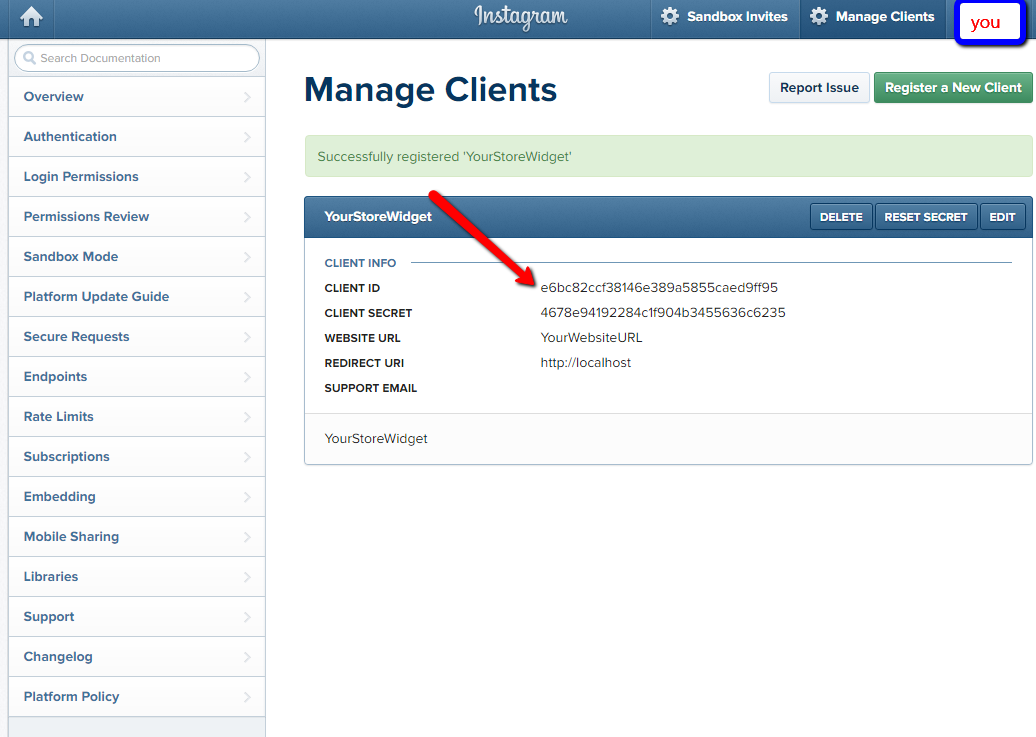
-
Paste the following url into your web browser.
and add the client id you generated to the url replacing [CLIENT_ID_HERE] Hit enter, and you will connect to Instagram’s servers. Instagram will ask you whether you want to grant the client you registered in Step 2 access to your account. Once your client has been granted access to your account, Instagram will redirect your browser to your localhost and your newly generated access token will be appended to the url after localhost/#access_token=Treat your Instagram access token like you would your password. Do not share your access token with anyone.
-
This is the last page you will see after Authorizing access. Now copy code you see after localhost/#access_token=”yourcode”
-
In WeltPixel Menu -> Cleo Theme -> Customization Settings -> Instagram Client ID field insert the ID generated in step 5, and in Instagram Access Token field insert the code from step 7.
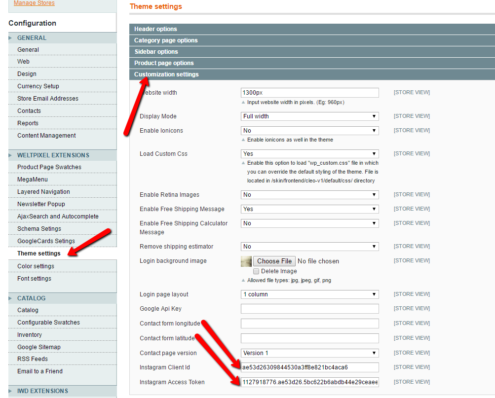
- That’s it, you’re all done! Now your instagram widget should work on your store homepage.
FAQ, Troubleshooting & Optimization
FAQ
Please consult the FAQ section from our website at this link: Cleo Theme FAQ
Troubleshooting
· Make sure that you cleaned your cache after installing the theme
· If the theme is not enabled properly, go to System -> Configuration -> Design
§ Package -> Current Package Name -> type cleo
§ Themes -> Default -> type default
· You have some third party extensions which can break theme's default behavior. The solutions is to disable all extensions and flush the cache, than enable each module one by one to find the extension that is causing the issue.
· Blank or 404 page when trying to open theme admin page? Simply log out and log back into Magento
Website Optimization Tips
A Fast & Optimized Website has several factors which needs to be implemented in order to achieve the desired results. There are several Optimization Techniques available which will definitely affect your Website's Performance in a Positive Way & we want to share a few of them with you:
-
gZip Compression & Browser Caching
This is probably one of the Most Important Techniques you should definitely implement in order to bump up your Website's Loading Speed. gZip Compressionis used to compress the Files that are delivered when loading a Website. It covers HTML, CSS, Javascript & Font Files along with other miscellaneous text files. Where as Browser Caching also covers Images & Videos apart from including the above files. This is used to saves the Static Data in your Browser itself so that when you open the Next Pages on the Same Website, the content does not gets Downloaded again, loading the Website fast.
gZip Compression & Browser Caching can be enabled using the
.htaccessFile on an Apache Web Server. You can use the Codes from here:https://github.com/h5bp/html5-boilerplate/blob/master/dist/.htaccess to enable these modules on your server. -
Image Compression & Optimization
We tend to use Lots of Images on our Websites but we often do not make efforts to Compress & Optimize them. Remember, the Larger the Image, the more time it takes to download and therefore this slows your website loading times affecting User Experience. Your customer will leave your website if it does not load within 3-5 Seconds which adversely affects your Sales. Therefore, it is important to Resize, Optimize & Compress your Images before using it on your Website. Here are some Tips which might come handy in optimizing images:
-
Resize your Images: Resize your Images before using it on your Website. Do not just Download an Image & place it as it is in your Website's
<img>Tag without resizing it. The size/resolution of the Image matters since it is not recommended to use an Image size of1200pxx800pxin a Content Size of300pxx200pxas this is unnecessary. Resize it to300pxx200px - Image Formats: There are three common file types that are used for web images which are JPEG, GIF, & PNG. For images with a Flat Background useJPEG images, for images with a Transparent background use PNG images and for images with Animations use GIF images.
-
Compressing Images: Images Compression is important as it considerably reduces the size without losing the quality. There are several FREE Image Optimization Tools available to Download.
For MAC use ImageOptim
For Windows use Riot for compressing JPEG Images & PNG Gauntlet for PNG Images.
-
Resize your Images: Resize your Images before using it on your Website. Do not just Download an Image & place it as it is in your Website's
-
CSS & jQuery Minifications
It is also recommended that you Combine & Minify all your CSS Files to a single CSS File & all Javascript Files to a single JS File since Minification reduces the size of the File and Combining the files helps in reducing the number of HTTP requests made to the server. This is also an Important Factor in increasing the speed of your website. There are several tools available online to Minify your CSS & JS Files. Our recommendations are:
For CSS use CSS Minifier and For Javascript use Javascript Minifier. -
Content Delivery Network
You can use a CDN to further speed up your website. You can use the CDN to deliver static files of your website like CSS, JS, Images & Font Files. There are several CDN Hosting Providers available on the Internet but we would recommendMaxCDN or CloudFlare. Note: CDN setup requires Extra monthly Fees to setup, so it is completely optional & according to your needs.
IWD one page checkout - 3rd party module
All options can be found under:
WeltPixel -> IWD one page checkout
Global
· Enable Module? - Enable / disable extension
· Title - Meta title to be used for the checkout page
Default Settings
· Default Payment Method - Select default available payment method
· Show Subscribe to Newsletter - Show checkbox “Subscribe to Newsletter”
· Check Subscribe to Newsletter by default - Automatically have this checked for the customer
· Show Shipping Address Form - Show / hide shipping address form
· Terms and Conditions Output Type - Select pop-up or inline
· Show Comment Field? - Show / hide comment field
Geo IP
· Enable Country Detection - Enable / disable detection country by user IP
· GeoIp filename - Download and unzip file under the 'MAGENTO_ROOT/lib/MaxMind/GeoIP/data' folder if you don't have it by detection country. Enter file name to field.
· Enable City Detection - Enable / disable detection city by user IP
· GeoCity filename - Download and unzip file under the 'MAGENTO_ROOT/lib/MaxMind/GeoIP/data' folder if you don't have it by detection city. Enter file name to field.
PayPal Express LightBox
· Enable PayPal Express Lightbox - Enable / disable PayPal Lightbox
· Sandbox - Enable / disable test mode of PayPal gateway
Log in with PayPal
· Enable Log in with PayPal - enable / disable Log in with PayPal
· Client ID - enter client ID for PayPal
· Secret - enter secret for PayPal account
Sandbox - enable / disable test mode of PayPal gateway
Customization services
If you would like to customize Cleo we can help you with that. We are Certified Magento Developers and we know our product well. Just send us an email with your requests and we'll send you a quotation. Contact us at support@weltpixel.com .
Changelog
What's new in 1.4.5 (July 05, 2016):
- fix for addtocart issue with cleo and other themes in paralel. (other themes add to cart was broken before)
- new instagram widget added with canvas and client id + token configurable from backend
What's new in 1.4.4 (June 08, 2016):
Community:
- new feature: google cards module added to the theme
- adding form-key, in case One Page Checkout is disabled to customer login
- normalisation of rating summary for schemas
- fix for One Page Checkout agreement
Enterprise:
- new feature: google cards module added to the theme
- adding form-key, in case One Page Checkout is disabled to customer login
- normalisation of rating summary for schemas
- removing IWD One Page Checkout from the theme, adding support for IWD OPC Pro (installed separately)
What's new in 1.4.3 (March 31, 2016):
- admin custom css colour options button hover and button background colour proper saving
- mobile mega menu, global notification css adjustments
- adding proper ordering for configurable products attribute options
- fix for static content import notification
- fix for ajax layered navigation rendering, there was a problem when category was called products
- fix for mobile layered navigation price filtering
- fix for wishlist addToCart
- fix for home menu link translation
- fix for cart page product quantity input issue: when enter button was clicked cart was emptied
- Enterprise version: Adding customer custom attributes to registration and login forms
What's new in 1.4.2 (January 04, 2016):
- checkout cart page css fix, when no cart shipping message the layout was broken
- checkout order summary fix (css fix)
- checkout shipping estimate validation fixes (css fix)
- checkbox image taken from cleo/default hardcoded image fix (css fix)
- translation fixes (more details in quickview)
- adding global message promo block functionality (new feature)
- fix for patched magento installations (permission blocks updated properly)
- scroll to top of the page after ajax calls (javasript update)
- customer account creation fix, missing form_key
What's new in 1.4.1 (November 09, 2015):
What's new in 1.4.0 (Nov 03, 2015):
- important Megamenu optimization
- User Guide major update
- CSS improvements
- small general layout fixes
- fixes for layout in product page
- documentation for static blocks and static pages
What's new in 1.3.0 (Aug 2015):
-design improvements
-functionality improvements for cart and ajax
- fixed add to cart product counter for more than 3 products
- fixed list view - picture size fix for mobile
- fixed top layered navigation overlapping issue if left right columns are there
- fixed grid vs list view - ajax bug
- improvement - add to cart, suggest to select options by sliding down
- spacing improvements
- optimization of category page
What's new in 1.2.0 (June 2015):
-added contact form V2
-added header style V3
-added category and product page default layout option
-improved layered navigation swatch rendering with relative path in CSS
-navigation font styling
-layered navigation checkbox look update
-lightbox styling update
-product page spacing improvements
Thank you
Thank you for your purchase
We hope you like our product and we look forward to work with you again in the future.